For quick contact: +90 532 288 2200


Sample the design at several actual sizes on the same fabric. Check the strokes, counters, openings and dots at the product’s normal viewing distance.
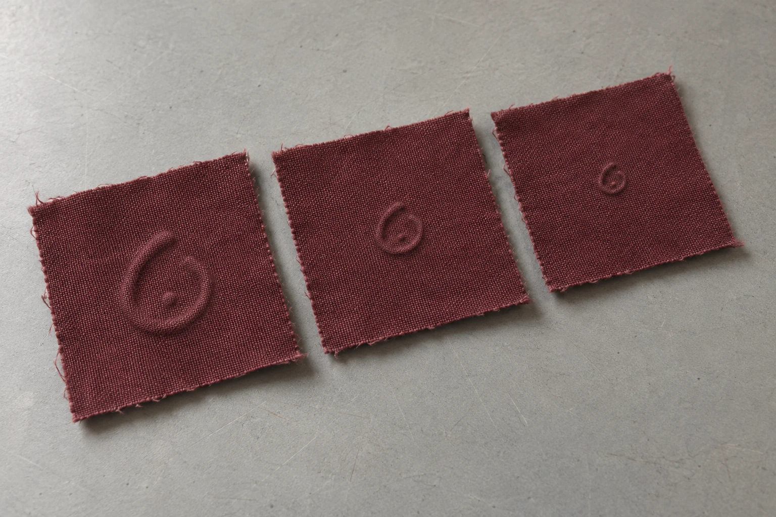
To choose a size for small embossed text or a symbol, make several actual-size samples on the fabric you plan to use. In the first trial, vary only the overall size. At a borderline size, make another trial that changes the stroke width or the space inside the mark. Look for the thinnest raised line, the spaces inside letters, the openings between stroke ends and separate dots or accents. Review the samples close up and at the distance from which the finished product will normally be seen. Choose the smallest tested size at which the required details are recognisable. Check that decision again if the fabric, design, direction or position on the product changes.
Imagine a mark on burgundy woven fabric. An open loop shaped roughly like a drop has a small dot inside it. On the smallest sample, the fabric between the two ends of the loop may become hard to see. You may still see the dot while the top of the loop looks closed. In the middle size, the opening may be easy to find while the dot only reads when you get close. A detail photograph helps discuss the difference. For approval on a product, give the reviewer the physical piece and ask what they see from the intended distance.
Write down which parts must be recognisable on the finished product. In one design, every letter of a word has to be identifiable. In another, an opening and a dot distinguish the intended symbol. Specify the actual spelling and script. An overall width does not tell the supplier how much space remains between individual features. Identify the thinnest stroke, the enclosed space inside a letter, the opening between stroke ends, and the spacing to the next character. If there are dots or accents, record how wide they are and how far they sit from the main shape.
A closed counter is a space surrounded by a stroke. An aperture is an opening from an interior space to the ground outside. A lowercase e, for instance, has an enclosed counter and an opening elsewhere. If its opening appears to close on the fabric, the letter may be harder to distinguish. In joining scripts such as Arabic, the shape in context, the connections and the distinguishing dots are all relevant. Inspect individual letters and also test the actual word or line in its intended layout. If the design will appear in more than one language, identify the narrow spots in each, including any additional accents or marks.
Write down what the size measures and in which unit. For a single symbol it could be the overall width between the outermost points. For a word it might be a specific letter’s visible height or the full width of the line. The point size of a font specifies a different dimension from the physical height of the embossed shape. Open or print the artwork at actual size and confirm a known dimension. Identify enlarged views as details. Put the sample code, face and fabric direction where the supplier can find them next to the size of each variant.
If a letter has an accent that extends above the others, show whether the overall dimensions include it. That extra height can matter if the design is close to a seam or fold. Keep the height of a typical letter separate from the limits of the whole word. Give the supplier the intended position on the product when there is a tight space. If the lettering must fit within the same limits after a stroke change, state this in the drawing.
Prepare several sizes of the same shape first. In the loop example, you might make versions 8 mm, 11 mm and 14 mm wide, scaling the dot and the opening along with the rest of the shape. These figures are starting points for comparison. Choose a different range if the product area or the supplier’s trial suggests it. Note the thinnest line, the smallest opening and the dot size for each version. If only the dot becomes hard to recognise on the smallest sample, enlarge that detail or change the space around it in a second test.
Ask for samples on the intended fabric, with the same face and comparable conditions. Include several repeats if practical. An impression near a cut edge or a join can sit on a different support from one at the centre. Start with an even area of cloth. Label the samples on the back or outside the inspection area. If one size needs a different process, record it with that sample. Give the supplier the artwork at the intended dimensions and describe what needs to stay recognisable. A toolmaker’s minimum feature size is one input for planning the physical trial.
For a second comparison at the borderline size, try giving a thin stroke more width or keeping its width and opening the gap between the ends. If the dot disappears, make a separate version that changes only its diameter or the clear space around it. State where the change was made. A stroke thickened inwards can reduce a closed counter. Moving the end of an open stroke can affect its distance to another line. Check the updated measurements before the trial. Look at the smallest details and the whole word or symbol when it returns.
Spread the repeats across the test card if you want to see whether a result is local. Two copies of the same size in different positions can show whether only one sits over a small weave irregularity or near the edge. Keep the sample codes with a diagram of the card. When asking someone to read the pieces, vary the order and leave the sizes off the visible face. Record the description first, then match it to the size and the physical sample.
Lay the swatches under the same soft side light with the fabric in the same direction. Find where the thinnest stroke becomes faint. Check whether you can see the ground inside an enclosed space. On an open loop, look both at the physical gap and the way the ends cast shadows. Two slopes can extend towards the gap and leave less flat fabric between them. Sometimes the lines are physically separate while their shadows seem to meet. Check from above under diffuse light. For a dot, see whether its shape is distinct from the adjacent ridge or letter.
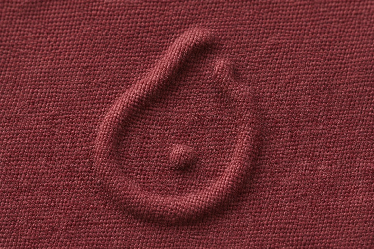
Look at more than one copy of a sample. A raised yarn or a crease may obscure a line on one piece. If the same detail weakens in each repeat, tell the supplier exactly where it happens. Use a close view to mark the end of the last visible stroke or the part of the counter that has closed. Record apparent separation and any physical measurement separately. A gap that can be measured from above may be difficult to identify at product distance. For a small word, ask the reviewer to read it once without an enlargement or a reference image. Then check which letters were recognised and which were inferred from context.
A person who knows the word may fill in a missing letter. Compare the result with someone who has not seen the drawing. Ask them to read it at the intended distance before pointing at any feature. For symbols, ask them to describe the opening and the dot before showing the original artwork. If a person picks out only the outline, record which other features they could find with a closer view.
Examine the design where it will sit on the product. A flat part of a bag flap and the curved edge of the same flap catch light from different directions. A garment label seen up close has different requirements from a motif that must be recognised on a panel at a distance. Choose the viewing position and distance before the comparison. To compare sizes, use equivalent mock-ups with the same panel size, support and fabric direction. If the whole panel changes as well as the size of the mark, record those effects in a separate placement comparison.

Let people look before you tell them which detail to expect. One person may recognise the loop and miss the dot. Another may notice the dot and be unsure whether the loop is open. Record what they recognised. If both details are part of the requirement, check both before accepting the size. Repeat the view under diffuse and directional light. An observation made with ideal grazing light is most useful when the viewing condition is recorded alongside it.
Keep the macro photograph with a view at the normal distance. The close view helps explain the stroke and ground. The wider view shows how the mark sits next to seams and other features. Use the same sample identifier on both. If you plan to use the design at two locations, test both. If the fabric changes colour while keeping the same structure, compare the appearance again under equal light. The same contour can be seen differently on a light or dark ground.
Use the lighting the product will usually receive. Note which face was examined first. If a seam or folded edge casts a shadow across the mark, capture that position and a position without the shadow. A similar motif placed on an inside label and on the outer face may need separate approval. Evaluate each one with the required details and with the cloth supported as it will be in use.
Link the chosen sample to the fabric code, colour, face, artwork dimensions and viewing distance. Describe which characters or features were recognised and what happened to the gap and the dot. For example, a result could read “in the middle size, the upper gap and dot could be distinguished separately on the flap in diffuse light.” That gives the next reviewer something specific to check. Keep the physical sample with the artwork version. If a stroke width changes, show which edge moved and which measurement stayed fixed.
Before agreeing to a revision, specify the stroke or gap that needs another check. A request for more definition can lead to thicker edges that close the space you wanted to keep. Use a marked copy of the photograph to guide the discussion and retain the unmarked image as a reference for the next trial.
The smallest passing sample identifies one tested size. If the product needs a smaller mark, make a trial at that size before confirming it. Apply the result to the fabric, process, finish and product position actually reviewed. If the design will be read mainly in a product photograph, check the physical sample at the typical photography distance too. Keep the actual-size artwork, approved fabric and viewing conditions together so the next team can check the same features again.
phone: +90 212 576 5250
fax: +90 212 493 0336
email: info@unlutransfer.com
Yenidoğan Mah. Eser Sok. No: 6-8
Bayrampaşa, 34030,
Istanbul / Turkey
TR 9150171175
Bayrampaşa Tax Office