For quick contact: +90 532 288 2200


Compare a matte knit, a lustrous woven satin and different ground shades. Review direction, lighting and lining on the finished samples.
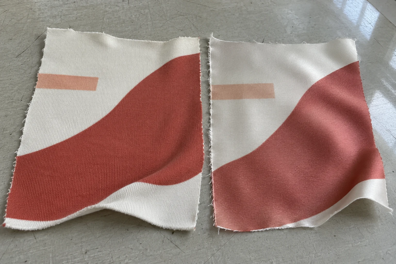
Two polyester fabrics can show the same transferred design differently because their ground shades, surface structure and reflection of light differ. The small shadows between loops on a matte knit can remain visible through a colour field. On satin, the same patch can look lighter as a highlight moves over a fold. A lining can also change the look of pale colours on a fabric thin enough to show what is behind it. Compare the unprinted bases, then compare the finished prints under the same light. Turn the fabrics together and review them with the lining or backing intended for the product.
Imagine a wide brick-red curve and a small peach stripe in a collection. One piece will be printed on matte polyester jersey and another on polyester satin. The broad red fields might look close when viewed flat. When the satin moves, a highlight may run across the stripe. A warmer ground can also pull the pale peach towards the colour of the cloth. Describe each of these effects in the sample review. The difference that changes with the viewing angle needs a different check from a warm ground that is visible in every position.
Polyester names the fibre. Jersey describes a knit structure. Satin is a weave in which the surface yarn arrangement can give one side a more lustrous appearance. Both fabrics in your sample set can be polyester while looking and handling quite differently. Put the exact fabric code, finish and face on the record. If you turn a woven satin over to inspect it, make sure the production face remains identifiable. Two samples assessed from different sides can give quite different impressions before you even consider the print.
One cloth may have a softer, more open structure, while another is denser. The same printed outline can look different from a distance even when the shape on the fabric is similar. The small loops in a knit may interrupt the apparent edge of a narrow detail. A satin surface may show a smooth edge under diffuse light and a bright patch across it when it bends. Look at a flat printed area close enough to see the structure, then look at the same part at the intended viewing distance and in the position it will take on a garment.
Keep the artwork scale and colours common for the first comparison. Save an unprinted cut of each fabric, and ask whether the same transfer conditions were used. The printer may make the samples under different conditions to suit the two fabrics. They can still tell you how each finished option looks. Record that they represent different combinations of fabric and process, so you have enough information to reproduce the chosen result or to ask a narrower question about the surface later.
Plan around the way each cloth will be used. Jersey on a sports top may hang freely in some places and stretch across others. Satin on a skirt may show folds when worn. Comparing both pieces flat provides a common first view. For the next view, hang or bend the satin and hold the jersey in a position that resembles the garment. Avoid pulling a swatch much farther than the finished product would stretch. Record which view revealed the difference.
Lay both samples down with the intended face up and the same orientation to the lighting. Look from above first, then from one side. Turn the samples together and see how the same colours change. When a light patch moves with the reflected highlight on the satin, note where it crosses the print. If one area remains warmer or lighter after you turn the fabric, also compare the unprinted ground and check the recorded transfer conditions. A colour difference and a directional highlight can both be present.

Take a photograph with both samples in the same frame if a second team will inspect them. A heavily curved piece and a piece lying flat will reflect the light differently. Show both in a comparable position, then take a second picture that explains how the difference appears in a natural fold. Keep the fabric direction with each view. The photograph can locate the effect. For a colour decision, show the actual pieces under the agreed light.
When a bright spot seems to reduce contrast, watch what it does as you turn the satin. The stripe may be easy to read again once the highlight moves away. If a pale impression stays in the same part of the printed field, describe it separately. Compare the unprinted satin at a matching angle to see how the weave itself reflects the light. Describe which changes travel and which stay in one place. The distinction helps the printer choose a sensible next sample.
Check the direction in which the garment pieces will be cut. Two parts from the same satin can catch different amounts of light if they are turned relative to one another. If the cutting plan allows a reversal or rotation, put the proposed panels together in those directions and inspect the seam or join. Mark the orientation that was reviewed with the pattern. Also note whether the result was seen flat or hanging, especially if a highlight near the join affects a small detail.
Before printing, view the two bases side by side under the same light. One may look cool white and the other more ivory. The difference can be more apparent through a light peach detail than through a deep brick-red field. Include a clear margin in the sample or keep an unprinted counterpart. Compare the grounds first when a new lot arrives. This helps you decide which light and dark areas of the design need to be sampled again.
If the material lets the background show through, make two comparisons. First put the fabric over a common neutral backing. Then put it over the backing planned for the product. A folded piece on a card can look different from a single layer hanging freely. A light lining and a dark backing can also make the same pale print look different. Use the actual combination for the product decision. Keep the neutral comparison available if you want to judge how much of the difference comes from the backing.

A lining can affect two printed fabrics differently because they show different amounts of what is behind them. Hold each sample in the way the finished garment will sit. If one contains an unlined section, review the boundary of the lining on the same piece. A peach detail that crosses from a backed area to an open area may appear to change shade partway along. Use both sections in the sample so you can see the transition directly.
For a comparison of two linings, look at the same part of the same print over each one. Changing to a new motif position introduces a difference in the printed colour that may already have been present. Keep the number of layers and their position comparable. A folded lining can cast a shadow or change how much light passes through. Note which lining was used on each side and how the pieces were held. If the shade difference appears only with one layer, record that it depends on the arrangement.
If the lining ends near a hem or seam, make the sample large enough to include the join. Check the print above and below the lining edge with the piece hanging naturally. Note whether the apparent shift follows the boundary as the cloth moves.
Find the part of the motif that has to remain visible from the normal viewing distance. On a knit, the small changes in surface height can have a greater effect on a fine line than on a large colour area. On satin, a broad light reflection can pass over the same line. Review a piece of the design at its actual scale. If the main brick-red shape looks good on both fabrics but the peach stripe loses contrast on one, ask for a targeted sample of the stripe. The rest of the print can remain as a reference.
For a design repeated across a garment, look at one full repeat and then at a larger area. A pale detail may be easy to find when you search for a single example. Across a full panel it may carry less weight than planned, especially if the ground is close in shade. Hang the two materials so you can inspect each in its normal position. Decide whether the stripe needs to remain visible at every angle or whether changes with movement are part of the design.
If the two materials will sit near one another in the same collection, bring the relevant areas together. First make the colour decision under the agreed light. If the garment will be viewed under a known second condition such as shop lighting, compare the pieces there as well. A difference that appears only when sunlight reaches one satin fold has a different effect from a colour mismatch across an entire front. Record the light and piece placement for any result that changes your decision.
Agree on the measurement conditions if a numerical colour check is part of the job. Discuss sample direction, backing, number of layers and the area measured. A measurement taken over a broad uniform patch gives information about the shade under specified conditions. Visually review the fabric in the construction used for the product, which may mean using a single layer, a lining or a fold. Save the reading and the observation separately so the next reviewer knows what each result describes.
Write down the visible results that drove the decision. One record might say that the brick-red field looks even on matte jersey, the stripe loses contrast on a satin fold in side light, and a pale lining makes the peach more visible on the thinner piece. Identify the fabric, face, direction, light and lining for each note. This gives the printer and garment maker a way to reproduce the comparison. If you want a new sample, say whether it should address the surface, the colour relationship or the assembled product.
If you have accepted one fabric and a second is still under review, keep the first as a named reference. A matte fabric can keep the detail visible with little backing effect, while the satin can give the movement the design calls for. The choice depends on which effect matters in the product. If both remain in the collection, state where each will be used and whether they will be worn together. Tell the cutting team the face, direction and backing conditions used for approval.
Keep the approved fabric, the matching unprinted piece and the file and lot information together. If the ground or lining changes, return to the observation that the change could affect. When you review fabric printing options, give the printer the intended polyester, the part of the design that must remain clear and the construction or lighting conditions that matter to the sample.
phone: +90 212 576 5250
fax: +90 212 493 0336
email: info@unlutransfer.com
Yenidoğan Mah. Eser Sok. No: 6-8
Bayrampaşa, 34030,
Istanbul / Turkey
TR 9150171175
Bayrampaşa Tax Office