For quick contact: +90 532 288 2200


Print the same glitter mix on both colours. Compare the visible ground, the edge of the clear layer and the option of an underprint.
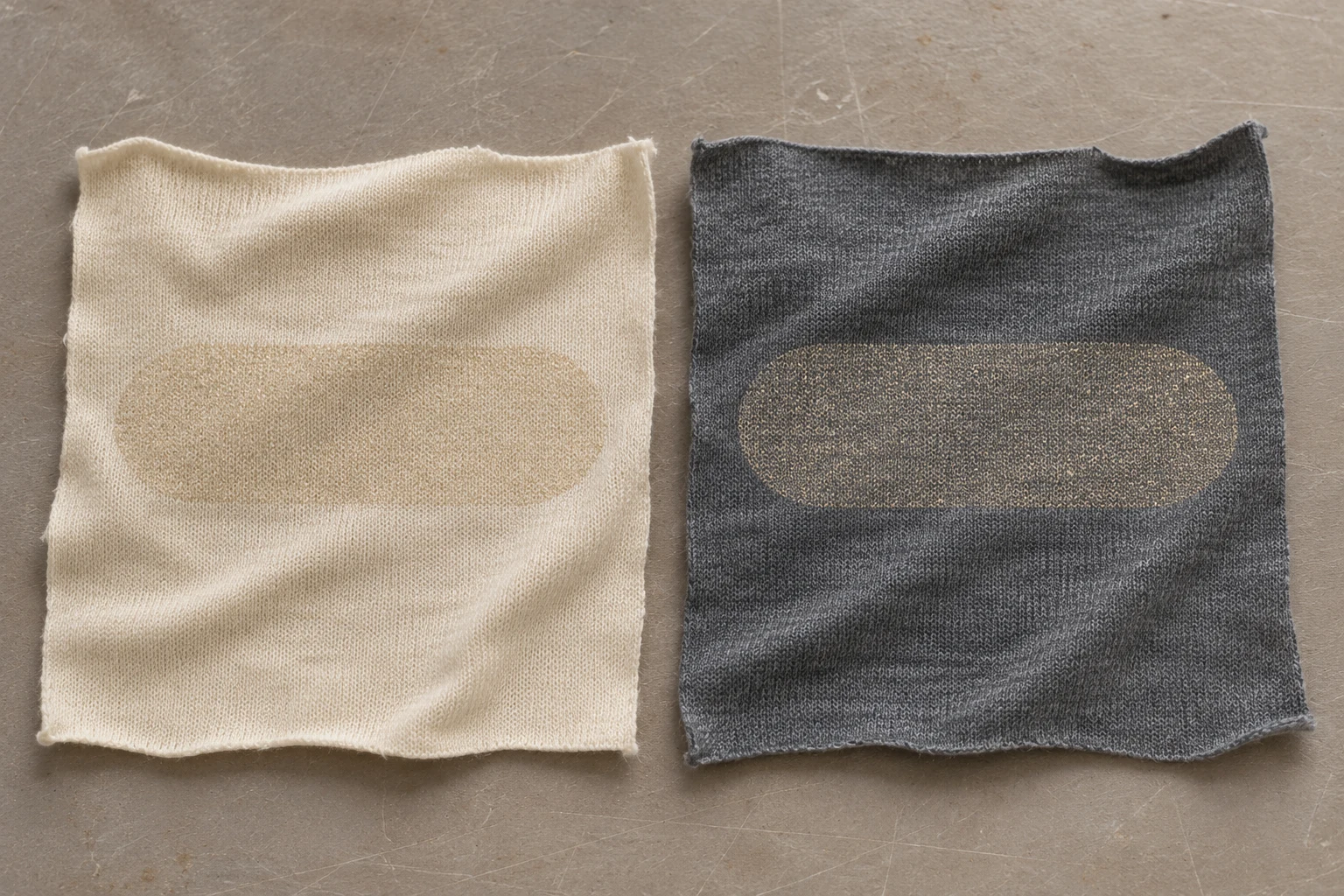
Print the same clear glitter mix directly on the intended light and dark fabrics, using the same design at the same scale. Leave a section of bare cloth visible next to each print. Under even light, check how much fabric colour and texture you can see between the flakes. Tilt both samples together to see where the glitter catches the light and where the clear layer becomes visible. If the dark version needs a more defined shape or a different ground colour, compare the direct print with a separately labelled trial over a compatible underprint. That comparison helps you decide which part of the design or print system needs attention.
Imagine a pale champagne glitter motif on two jersey colours, warm cream and washed charcoal. The cream showing between the flakes may make the motif look soft. On charcoal, the dark gaps can remain visible while individual flakes flash when the fabric moves. Neither response is guaranteed by the colour name. Decide how much of the real cloth you want to see through the motif and whether the design should be easy to identify at its normal viewing distance. Then assess the same motif in both colours, paying particular attention to the smallest useful detail and the place where glitter gives way to plain fabric.
A clear binder can leave the cloth visible through spaces between the flakes. The area it covers can still reflect light differently from the surrounding fabric. The words clear and transparent describe the material's appearance, but the finished print may have an edge, a change in sheen or a perceptible layer around the flakes. Look at the base colour, the points of reflection and the boundary of the application individually. A note that says only that the print is too dark leaves all three questions open. A note about the visible charcoal loops or a brighter line just beyond the flakes directs the next proof to a particular place.
Keep the first pair as comparable as possible. Use the same binder, flake size and colour, motif, print direction and application conditions. Match the fabric construction if the aim is to see the ground colour's contribution. A cream jersey with more pronounced loops can affect apparent coverage and sheen alongside its lighter colour. If the two materials in the final range really are different, sample both as they will be used. Note which pieces compare colours on similar constructions and which represent actual collection choices. The samples can then be read in light of the specific decision that prompted each trial.
If the print system allows a small binder-only proof, it can help you see what the clear material does on its own. Compare that patch with bare cloth and with the same size of glitter print. Check the edge and the way light moves over the film. A layer without particles can spread or look different from the complete mixture. Treat the proof as an optical reference for the binder and use the glitter print to assess the combined effect. If a separate binder-only patch is unsuitable for that system, inspect the quieter spaces within the motif alongside a clean margin of the same fabric.
Use the actual motif in the sample. For a small design, add a broader proof in the same mix to provide enough area to see the fabric between the particles. Keep the small motif at the intended size so you can see whether it still reads on the product. Leave plain fabric around both shapes. A very tightly trimmed cutting can make an otherwise subtle motif seem prominent because there is little visible ground around it. With a useful margin, the reviewer can follow the transition from unprinted cloth to printed edge and into the middle of the design under the same light.
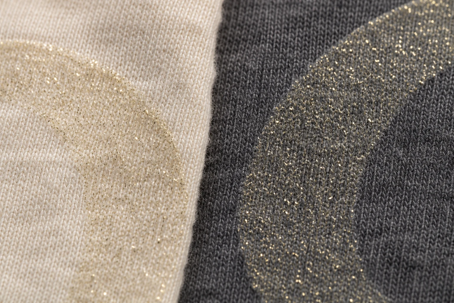
Start with the patches flat under even light. Look for the colour showing between the points and for any abrupt breaks in the print. Then tilt the samples together. A brighter patch at one angle may result from the same flakes reflecting more light. Compare the samples again in a position that makes the knit visible. If an irregular opening is still visible in the same spot on repeated proofs, record it separately from the normal gaps between flakes. That guides a different question about the print application. Identify how the motif looked across a wider area and how it looked in the smallest feature.
Read the edge in three places. Start in the fabric just outside the print, then look at the boundary and at a more densely printed part of the motif. If the clear layer appears to extend beyond the visible flakes, look at the same place with different lighting and compare it with the unprinted control. An impression from handling or a feature of the yarn surface may be visible under oblique light. Note which fabric and viewing angle show the line. The cream and charcoal versions can have equally distinct printed edges on the table while differing in how obvious those edges look at a normal viewing distance.
A thin light cloth can also pick up the appearance of whatever lies behind it. Lay both swatches on the same neutral support first. If the final item uses a lining or another fabric immediately behind the motif, check the light sample again with that layer in place. Record which setup was used to assess the ground. A close view of a cream swatch backed by dark cardboard can look different from a view of the same material backed by the intended pale lining. Assess the final colour and the boundary on the assembly that best represents the product.
Start with both swatches flat and oriented in the same direction. Note the ground colour and the visible boundary. Then turn the entire card or move both samples together, keeping the viewing direction comparable. If one end of the table catches more window light, exchange the positions and repeat the comparison. A difference that follows the place on the table may depend on the light. A difference that follows a swatch can be explored on that material. A side view helps show whether the print has a different sheen from the surrounding knit without relying on the brightness of an individual golden point.
At the expected viewing distance, decide whether the motif reads as a soft accent or a clearly bounded design. Come closer to see the loops and the edge of the binder. If the target is to use the same material across the collection, record the visual differences you accept on each colour. If comparable visibility is required, check the outline on both actual fabrics. A change in size, layout or underprint might make one colour fit the intent more closely. For curved or moving sections, put the motif in its expected position and review what remains visible when the fabric moves.
If sharing photos, include both colours in one frame and keep them on the same plane. Make one view flat and a second with both inclined if changing reflection is part of the decision. A phone can adjust its exposure or white balance in separate views. Add a short note to the sample record identifying which angle was used. Use close views to point out the part of the edge that needs attention. Keep the physical samples together for decisions that depend on slight differences in the clear layer or the colour between particles. The next reviewer can return to the same spot on the actual cloth.
If the direct print on charcoal is too subtle for the design, discuss a compatible underprint with the print team. Make a second sample using the same glitter mixture over that layer. Keep the direct print next to it. A lighter or coloured layer can change what you see between the gold points. It can also change the firmness of an edge or the way the fabric feels. Review the two versions for the effect the design needs. If the base fabric should remain visibly charcoal between the flakes, the direct version may suit that role. If the shape needs to read as a more continuous area, the underprint can be explored.
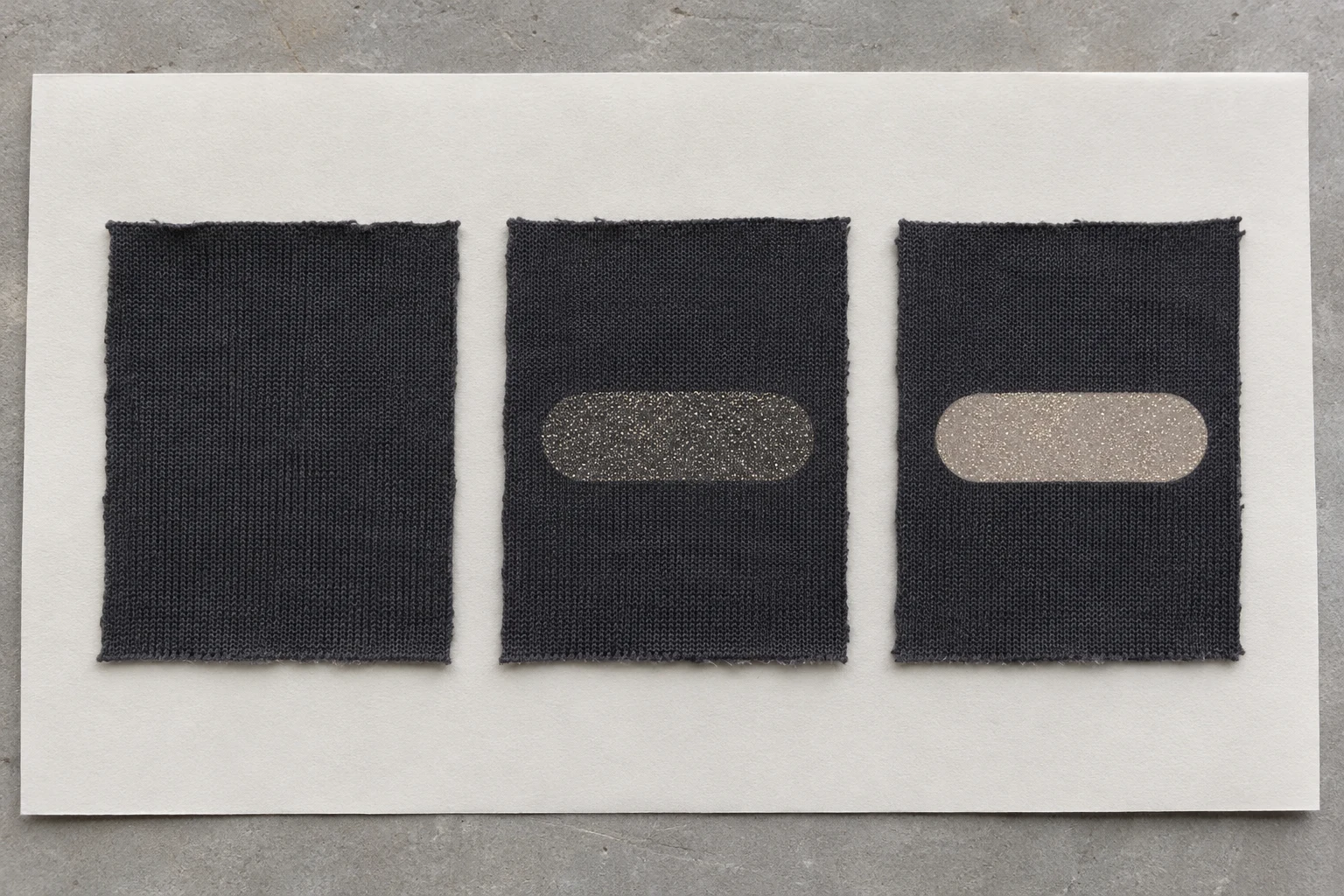
Compare the two versions along the outline, especially on a curve or the narrowest tip. If an underprint extends outside the glitter, a pale border can appear when the motif is viewed from the side. A border can be a deliberate part of the design. If the aim is to change only the colour visible inside it, check where that layer ends. Retain a piece of the underprint on its own when appropriate to the chosen system. Keep the cloth code and layer information nearby. The result belongs to the combination that was actually sampled, so confirm any move to a new fabric with the print team.
For a dark sample card, keep a strip of unprinted charcoal, the direct version and the underprinted version in the same orientation. Then decide whether the light cloth needs a comparable stack of its own. The unprinted strip helps you see where the substrate is visible. The direct print shows the effect on that exact dark knit. The version with a second layer shows the contrast that the underprint adds under the same light. If the initial proof differs in both binder and ground, label both changes. In the next comparison, adjust the variable that corresponds to the observation you want to resolve.
Keep the fabric code, binder, flake grade and colour, underprint if used, motif version, direction and date with the samples. Describe the appearance in specific terms. For example, “charcoal is visible between flakes in even light, with pale gold reflections when tilted.” Add a note about the edge and the viewing distance. For a lined or shaped piece, include the assembled section or its reference. If the fabric, binder or underlying colour changes, compare the new version with the approved one under the same conditions. Check the most sensitive area first, such as the narrow print edge on dark cloth, then review the other colour.
Include a simple sketch of the card arrangement in the record. Someone who receives the loose cuttings can then restore the direction and spacing before judging the light and dark samples together in the same position.
Bring both direct prints, the unprinted fabric and any underprinted trial to the final review. Start with visibility of the ground, compare the edge and then check the sparkle in the intended position. An appearance approval can tell you which option to take forward. If the project has requirements for adhesion or change after care, arrange the appropriate verification with the production and laboratory teams. The guide to glitter and foil printing on fabric covers the differences between those two effects. Once glitter has been chosen, a physical card records what the same mixture looks like over each planned ground and which layer arrangement produced the agreed result.
phone: +90 212 576 5250
fax: +90 212 493 0336
email: info@unlutransfer.com
Yenidoğan Mah. Eser Sok. No: 6-8
Bayrampaşa, 34030,
Istanbul / Turkey
TR 9150171175
Bayrampaşa Tax Office