For quick contact: +90 532 288 2200


Compare unprinted cloth, a sparse motif and a solid area on the same fabric to assess how digital pigment printing affects hand and drape.
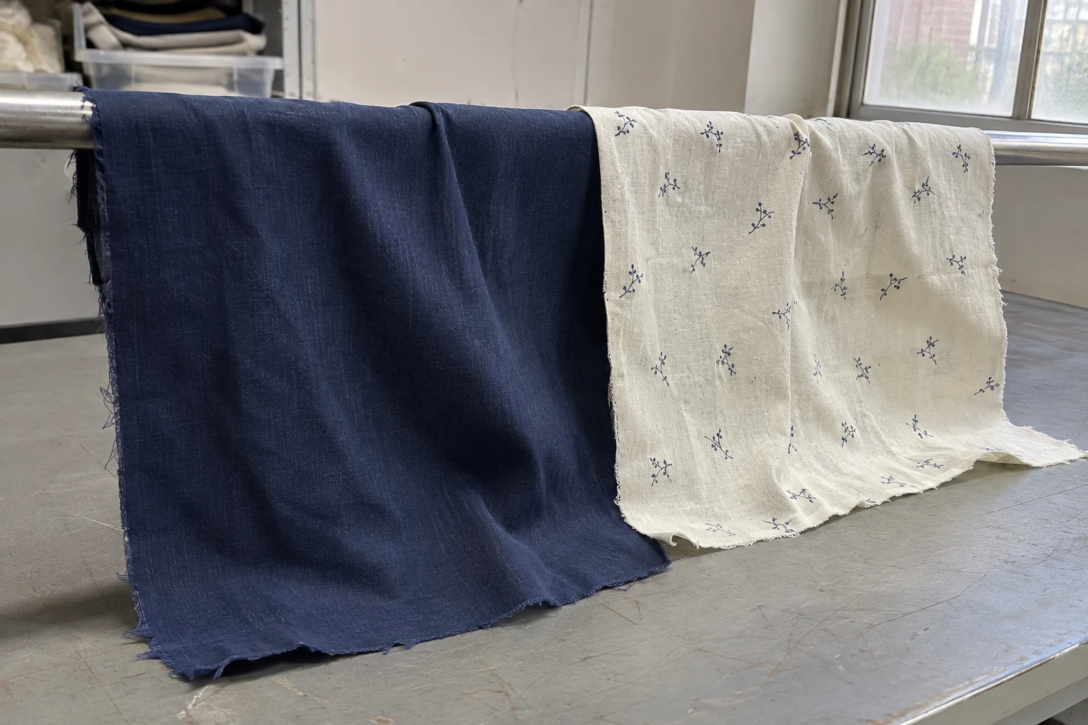
Compare three areas on the same fabric. An unprinted area shows how the material starts out. A sparse motif shows how it feels when the design leaves plenty of ground visible. A solid area shows what happens where the print covers most of the surface. Match the size, grain direction and processing history of the samples. Assess the feel of the surface and the way the fabric hangs under its own weight separately. If a solid area affects the drape, look at where the artwork concentrates the print and how that part of the garment moves.
In a lightweight blouse, a dark block across the whole front can move differently from a few motifs near the shoulder. If the approval swatch is cut from the sparsely printed part, the difference may only become apparent at fitting. The same extra body can be welcome in a collar or cuff. Decide which parts of the product need a loose fall, which need a smooth surface against the skin and which can carry more structure.
Fabric hand covers several sensations. As you move your fingers over the cloth, you notice smoothness or resistance. Bend it gently between your fingers and you can tell how easily a fold forms. Release the piece and watch how the fold opens. Describing a sample as “stiff” leaves these separate observations unresolved. If the next trial needs to improve a particular quality, give the supplier a description tied to a movement or a place in the garment.
One dark swatch can feel smoother to the fingertips while the other falls more easily over the edge of a table. The product determines which quality matters most. On a scarf or skirt, drape determines how much the shape opens as it moves. For a shirt cuff, a crisp fold can be part of the design. A softer surface may matter more under the arm or around the neck. Consider the different pieces of the garment when defining the target hand.
Make the hand review repeatable. One person may bend the fabric along the warp while another picks it up on the bias. A flat sample and a sample just unrolled may also sit differently. Lay the pieces out together and handle them in the same direction and sequence. When someone describes one as firmer, ask them to show the movement that made the difference apparent. “The bottom edge projects when it hangs” gives the next person a clear observation to revisit.
Pigment particles are held on the fabric by a binder. The printing system, the structure of the cloth and the way it is processed can all affect the surface that you feel. Two systems may reproduce a similar shade while leaving a different hand. Binder properties, preparation of the fabric and the way the print is fixed can all contribute. Approve a deep shade by checking its appearance and movement on the actual material.
Placement matters alongside the total printed area. Small motifs distributed across a panel can leave it free to bend in different places from one solid block of the same area. A printed band might cross the exact line where the product folds when hung or worn. When two artworks cover a similar amount of cloth, compare where the larger uninterrupted sections fall and which way the finished pieces need to move.
The cloth contributes to the result before the first drop of ink reaches it. A small difference may be easy to feel on a lightweight plain weave. A heavier twill can respond differently. Loose construction, density, surface fibres and earlier finishing all influence how the cloth behaves. Keep a record of the unprinted cloth at the start. This helps separate something you can already see in the fabric from a change associated with the print or processing.
Leave the first area unprinted. Add a sparse motif close to the intended artwork scale in the second area, with the fabric ground clearly visible. Use the third area for the dark solid planned for production. Give the printer a genuine colour and coverage target. A much darker block that will never appear in the garment can make the sample card harder to interpret.
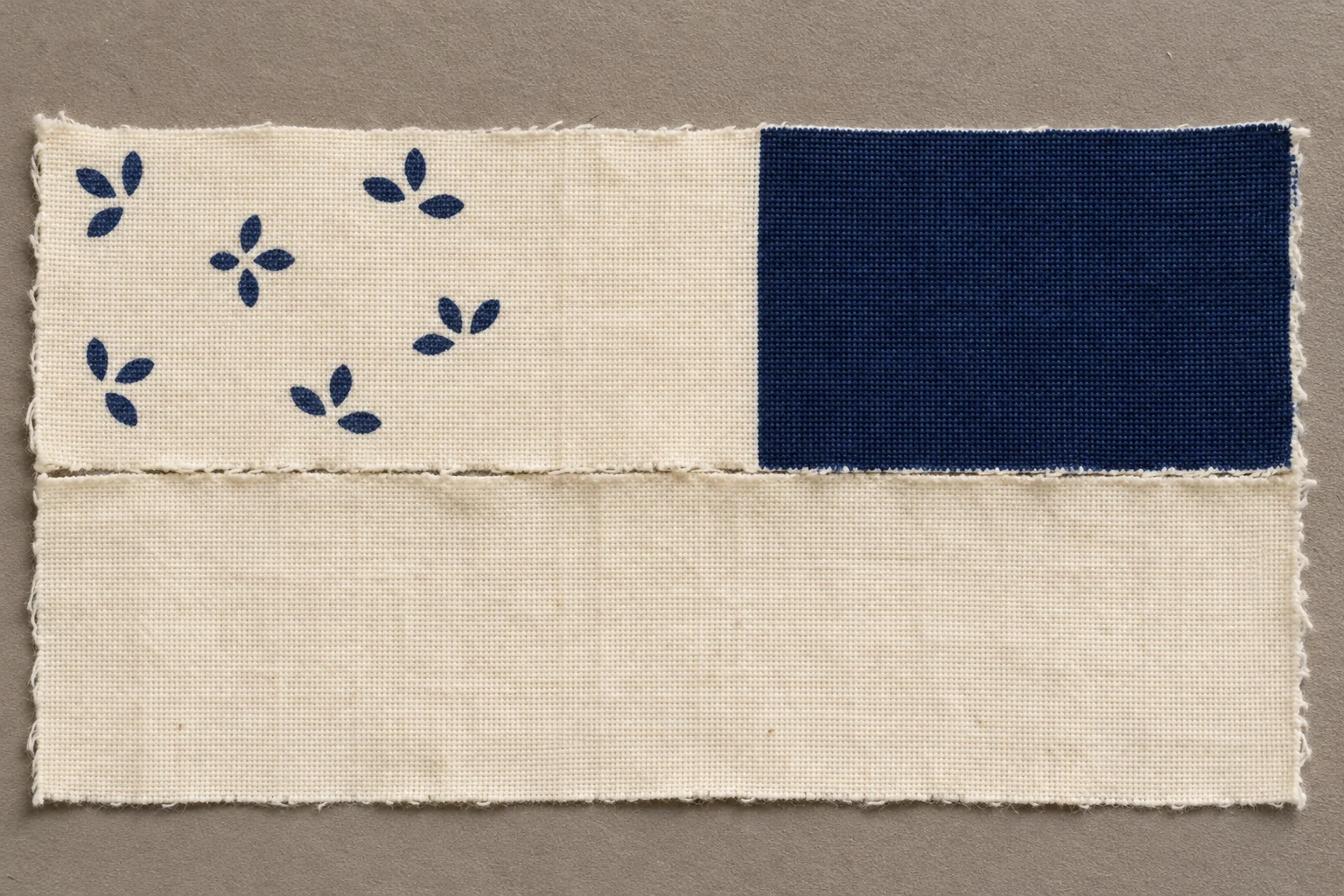
Whenever possible, use the same fabric and processing route for all three areas. Record which shared preparation and finishing steps the unprinted control goes through. An additional piece of untreated cloth can tell you what the material felt like before production. A processed, unprinted piece helps answer a different question about how much difference is associated with the printing itself. Retaining both can be useful if the material appears to have changed in every area.
Cut strips to comparable dimensions and keep the same grain direction. Identify samples from the edge and centre if you need both, especially when the original cloth is narrow or the layout restricts where you can cut. Mark pre-existing folds before cutting. Changes in length, width or orientation can affect how a strip hangs. Choose a size that fits the available material and use it consistently.
If the solid block and the sparse motif are made in different runs, retain the fabric and process records for each. Comparing one run to another can be informative once you know where the conditions differ. A sample card printed with all three areas in one trial gives you fewer variables to account for when you plan the next trial.
For surface feel, place the pieces on one table and touch the same face. Pass your fingers in the same direction, then repeat a movement that matters for the product. For instance, bend a piece as it would fold near a neckline or pinch it as you would while shaping an intentionally loose skirt panel. Have each reviewer write their first observation before discussing the samples as a group. That makes it easier to see where their assessments agree.
To look at drape, use strips of the same length and lay them over the same form, or hang them from the same height. Look at where each fold starts, how far it spreads and which way the printed face points. A broad, flat fall in a solid area and finer folds in the unprinted cloth can matter if the solid block crosses the middle of a flowing panel. Treat this comparison as an observation. If a smaller difference matters to the product, discuss a suitable laboratory method with the supplier.
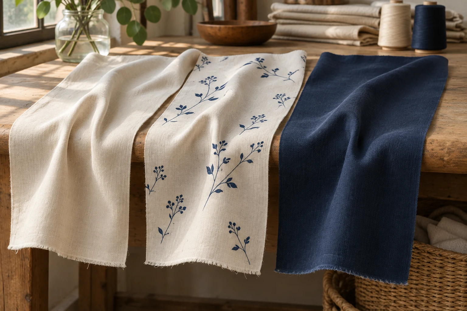
Reverse the samples to check how the face and back sit against the form. In the garment, the printed face might sit outside the bend in one place and inside it elsewhere. If the difference is slight, prepare two comparable pieces and watch how they hang in the direction used for the garment. Photograph the strips side by side from the same position if you need to document the comparison.
When all three samples feel firmer than expected, recheck the starting cloth. If the processed unprinted control is firm as well, examine the fabric and the steps shared by all the samples. The raw cloth may bend easily while all the processed pieces have more body. Opening up a solid area in the artwork may have limited influence in that situation. With a raw swatch and a processed unprinted control, you can make a more useful comparison.
When the unprinted piece and the sparse motif behave in a similar way and the solid area feels distinctly different, focus the first revision on that part of the design. Could the solid area be made smaller, broken up or moved to another panel? Would a lighter shade retain the intended effect? If the design needs to keep that dark block, give the printer the physical reference and the location of the block in the file. Review the next trial with the same size, cloth and direction of bend.
The team may find a difference in surface feel while the drape remains similar. A slightly rougher surface could be acceptable on an outer panel and objectionable along a bare arm. Conversely, two narrow strips may feel similar while a full skirt panel opens differently on a hanger. Where the difference matters is a design question. Compare pieces closer to the real size and orientation when a small hand swatch leaves that question open.
Keep the other approval requirements in view when the hand improves. Hue, edge definition and the necessary durability apply to the same sample. Ask whether the pieces sent for a durability check came from the same trial as the approved colour and hand swatches. This keeps the approval attached to an actual combination of fabric, artwork and process.
Identify the parts of the garment that need to move freely. On a blouse, the edge of the armhole, the area folding under the bust and the hem all move in different ways. Try opening the print specifically where that movement occurs. You might leave narrow channels of unprinted cloth between motifs, use a less extensive solid block or retain the dense area on a cuff where more structure is welcome.
Change one design decision in each alternative. In one version, keep the location of the dark block and divide it with narrow gaps. In another, retain the scale and tone and move the solid block to the cuff. The first trial lets you see how that part of the fabric moves after the change. The second tests whether moving the dark emphasis keeps the look of the garment. Label each version with its purpose so the right question is answered when the pieces arrive.
Opening a block can make a motif harder to read. Decide which colours and elements must remain clear. You may want to discuss another printing approach or a different fabric quality. When the weight or construction of the cloth changes, include an unprinted control for that cloth too. Then compare what you see and feel on a basis that matches the candidate fabric.
Suppose a blouse has a solid navy block at the front and a sparse motif along the sleeve. On the sample card, the sparse area falls freely. The dark block holds a broad fold when put over a form. That difference can be easy to miss on the table and apparent once the front panel swings on a wearer. Cut a small sewn sample from the area of concern and check it in the direction that the real panel will be cut.
Try breaking up the dark block while preserving the overall colour in the next version. Up close, narrow gaps may read as individual lines. At the intended viewing distance, the area may still look like one dark shape. Check both views on the actual cloth. Hang the piece and look again during fitting. If it falls more freely and the motif loses clarity, return to the size and placement of the gaps before deciding.
Record which panel holds the dark area and the direction of the unprinted gaps. In another size the fold can sit in a different place even if the ratio of printed to unprinted fabric stays the same. Trial both options in the same panel with comparable grain and seams. Keep the sewn piece with the matching artwork. It gives the production team a physical record of the shape they are working towards.
Keep the fabric code, artwork revision, grain of the samples and area covered by the approval in one place. Record hand, drape, colour and any durability requirement separately. “Front panel falls easily on the hanger and the dense print stops short of the armhole” gives the next team a condition it can check. A record like this also helps decide which comparison to repeat if the fabric or the artwork changes.
When you request a sample, say where the product needs to drape freely and whether the full-coverage print runs across that area. Bring the unprinted cloth, artwork and hand reference to the same review. If you are comparing ways to retain the colour and the fabric’s movement, explore digital fabric printing options and include the product's intended use in your request.
phone: +90 212 576 5250
fax: +90 212 493 0336
email: info@unlutransfer.com
Yenidoğan Mah. Eser Sok. No: 6-8
Bayrampaşa, 34030,
Istanbul / Turkey
TR 9150171175
Bayrampaşa Tax Office