For quick contact: +90 532 288 2200


Photograph the same swatch under diffuse and directional light. Keep the framing fixed and record settings you can reproduce.
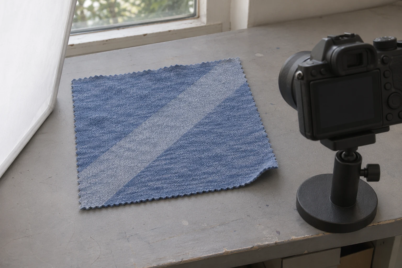
Take two photographs of the same textile in the same frame. Use broad, diffuse light for the first to show the ground colour, knit and print boundary. Keep the swatch and camera in place. For the second, use more directional light to make individual glitter reflections easier to see. Record the light position and camera settings. The pair lets a buyer see how the textile generally looks and how its sparkle changes with light direction. More visible points in one view can come from the same particles catching the light. Identify which lighting setup produced each image so the difference can be interpreted in context.
Consider a matte indigo jersey with a diagonal pewter-silver glitter stripe. In broad light, you can see the indigo ground, the knit and the spread of fine particles. With a compact side light, individual points can become more distinct while shadows at the edge of the cloth change. For the opening catalogue image, decide what the buyer needs to learn first. A photograph for choosing colour and scale should retain the cloth and the whole motif. An image for examining sparkle can show the way the print responds to a change in light. Give both views enough context for someone to recognise the same fabric.
Lay the sample on a matte, neutral surface. Record its direction and where it sits. Include enough unprinted cloth to read the ground alongside the decoration. For the indigo sample, a visible stripe end and a margin of knit help locate the same area in both views. Support the camera to keep distance, angle and lens consistent. If an edge of the cloth naturally lifts, let it sit the same way for both photographs. Applying tension to one view and releasing it for the other changes the knit and shape, which makes it harder to compare the effect of the light.
For several colourways, keep the camera and setup consistent while you make a pair for each colour. A close shot of one fabric and a distant shot of another will show the reflective points at different sizes. Start with a shared overall framing, then take a separate close view if the catalogue needs one. The wide view explains how the mark fits on the cloth. A close view shows the particles and yarns in more detail. Record where the camera and swatch sit so a new colourway can be photographed to match later. A small sketch or a setup photograph makes the position easy to restore.
Review what light is already present. Daylight through a window and warm room lighting can give different parts of the cloth different colour casts. When possible, use a consistent light source or closely matched sources for the pair. If you work with a window, keep an eye on changing daylight between frames. A cloud can alter the strength and direction of the light before the second shot. Make the two photographs close together and keep everything else still. If you have to change both the source and its position, note that the pair compares two setups. It does not isolate the effect of a single change.
Use a broad source or a suitable diffuser to spread light across the swatch. Start with a view in which the knit, the unprinted colour and the edges of the stripe are visible. Check for bright areas where pale particles merge into one patch and dark areas where the texture is lost. Look at a quiet area of indigo beside the stripe while you set the exposure. Then inspect the brightest part of the glitter as well. A useful general view leaves room to see the ink boundary and the fabric around it. It can serve as a reference when you look at the second image.

A matte neutral reference can be useful in a setup frame. Put it close to the cloth and in similar light, out of the strongest reflection. Save that frame with your settings. It does not have to appear in the image for the catalogue. If the camera lets you set white balance, record and retain the chosen value or measured reference under the shared light. A different light source can introduce a new colour cast even with the same camera settings. If the source changes, say so in the shooting notes and assess the cloth with the reference under the new light.
Fine knit patterns can look different when a large image is reduced for a catalogue. An interference pattern may appear in a small preview even when the cloth itself has no such marks. Inspect the full image and the export at its expected display size. If you need a different capture distance to remove a distracting pattern, reset both views at that distance. Keep enough plain fabric in the frame to see whether the effect appears in the knit beyond the printing. This helps separate a display or capture issue from the appearance of the glitter. Save the original images before exporting a smaller pair.
Leave the cloth and camera in place and move the light. Try a directional source that makes separate points in the stripe easier to see without turning the entire stripe into a bright white shape. Move the lamp in small increments and check what happens to the reflection. If one angle looks quiet, a nearby one can catch different flakes. Keep enough light on the indigo ground to retain the knit. Record where the source sat in relation to the cloth and camera. When you repeat the setup, use the same light position before changing anything to suit a particular sample.
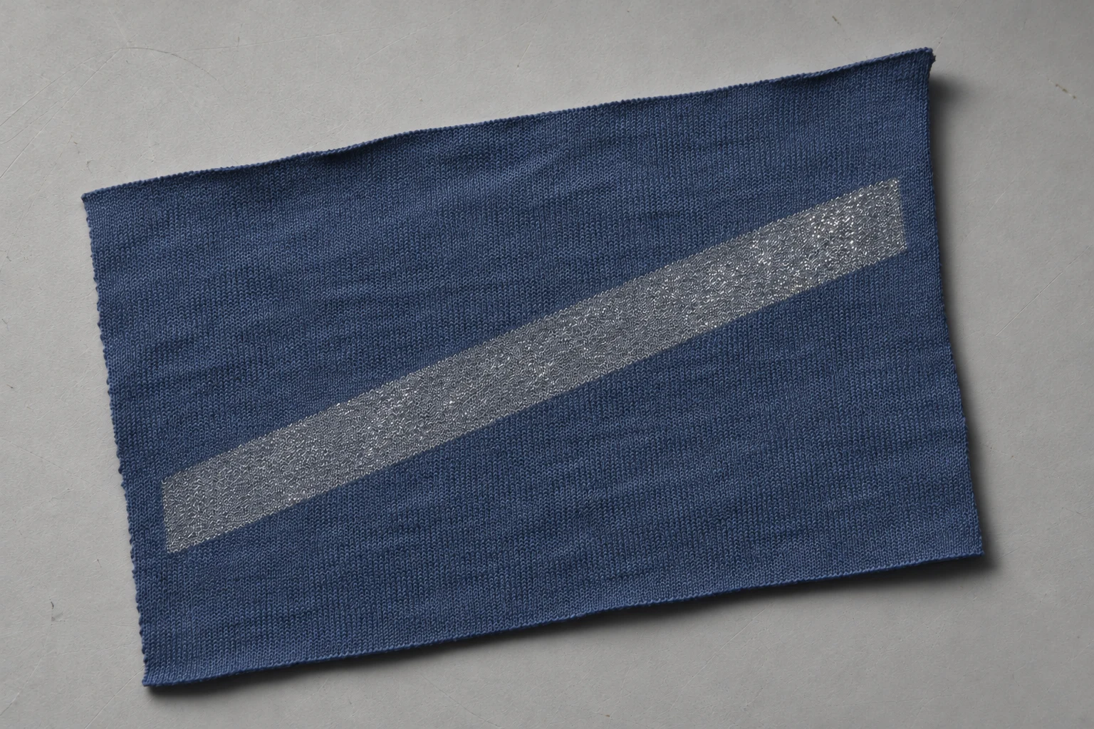
Keep the exposure settings fixed when making the comparison. On a camera with manual control, check aperture, shutter speed and ISO. Auto ISO can be active even when the other settings are manual. Fixed settings make comparisons easier to reproduce, although the cloth can still appear lighter or darker when the light changes. If one setup overwhelms the other, adjust the light arrangement and make a new pair. Avoid brightening one file in isolation simply to hide the difference. If each image needs separate treatment for catalogue presentation, retain the fixed-setting pair as a reference for the next shoot.
On a phone, use the camera's focus and exposure lock if available. That lock does not necessarily hold white balance or all of the phone's image processing. Check framing, lens and focus after switching the light. Focus on the edge of the print or on the knit close to it. Compare the indigo margin in both views along with the brightest points. If the phone changes its crop or processing, restore a comparable setup before judging the reflections. The aim is to see an effect on the same sample rather than a difference caused by switching cameras or modes during the pair.
If the camera offers a histogram or highlight warning, use it along with a close inspection of the stripe. A few tiny highlights are different from a wide featureless patch. Check whether the stripe retains texture around the bright points and whether the cloth beside it still has a visible weave or knit. If the directional setup makes the ground disappear into shadow, move the light or restore some broad fill before repeating the pair. Record changes in power or distance. A moody image can be useful for a separate presentation, but the paired comparison needs enough surrounding detail to resemble the textile the buyer will receive.
Start with the image that best communicates scale, colour and motif. Put the directional image nearby and name what the buyer is viewing, such as a detail under directional light. Crop the two views consistently so the stripe and sample edges have the same relative size. If you add a close-up, identify it as a different scale. Apply adjustments in a way that retains the comparison. Avoid adding specular points or stylised star shapes that were absent from the original image. Check the plain fabric for halos if sharpening has made the glitter look brighter. Exaggerated processing can make the textile texture harder to recognise.
Online images look different at different sizes and on different screens. Check the page thumbnail and the large view before using the pair. If the fine points blend into an even stripe in the thumbnail, a separate close view can help show their scale. Keep the original overall image for the colour and motif. If a buyer needs to approve colour or surface texture, use a physical sample as the reference. The images help identify the material and communicate when the sparkle becomes visible. They also give the buyer and production team a shared place to look on the physical cloth.
Keep the sample code, print colour and date with both files. Record the camera position, lens, exposure, white balance when known, light direction, approximate distance and whether a diffuser was used. Label the diffuse and directional views so they can be found without opening each file. Save any shared crop or colour adjustments. If the source position changes during the second view, make a note of where it ended up. When photographing a later delivery, bring the approved swatch as well as its images. Seeing two actual samples under the same light helps you recognise a material change that descriptions alone may leave unclear.
Mark the lamp positions outside the frame. A note that says the lamp was to the right is easier to use when it also records its approximate height and distance from the sample. Indicate which side of the swatch faced the camera and where the diffuser sat. A simple sketch next to the two reference images is often sufficient. If several colours are photographed in a single session, the marks help the next person restore the setup after equipment has been moved. This improves continuity across the set as well as between the two views of one colour.
When a later delivery looks different, compare the new and retained swatches side by side under the same lamp before photographing each one separately. Take a shared overview at the reference distance. Then reproduce both lighting views for each sample. A common overview keeps camera settings and light position the same for both pieces. The paired views show whether the discrepancy is especially visible under diffuse or directional light.
Build the first pair for a sample that can be kept as a reference and review both views at the intended catalogue size. Then repeat the setup for the rest of the collection. The comparison of glitter and foil printing on fabric covers how those finishes differ in appearance. For a glitter print, the paired photographs should show what stays recognisable in both lights and what changes when the surface catches a more directional reflection. That approach lets a reader see the ground, the motif and the sparkle without relying on whichever of the two images looks brightest.
phone: +90 212 576 5250
fax: +90 212 493 0336
email: info@unlutransfer.com
Yenidoğan Mah. Eser Sok. No: 6-8
Bayrampaşa, 34030,
Istanbul / Turkey
TR 9150171175
Bayrampaşa Tax Office