For quick contact: +90 532 288 2200


Compare matte and glossy fabric under the same conditions. Follow the moving reflection and record the settings used for any colour measurement.
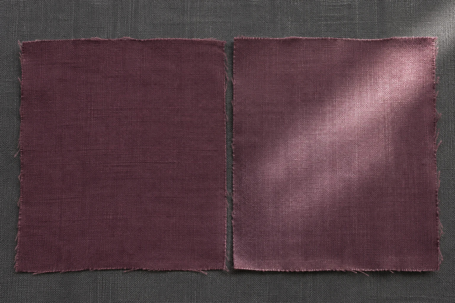
A strong reflection can make lacquer-like fabric appear lighter or less saturated. The same piece can look darker just outside that reflection. To judge colour, place the matte reference and glossy sample side by side on the same backing, with their grain running the same way. Compare their shade under diffuse light from a position where the brightest highlight is out of view. Then let a directional reflection move across the glossy cloth and see which differences move with it. Repeat the comparison under the light the finished product is likely to receive. If colour is measured on an instrument, record the measurement geometry and whether the specular component was included.
Imagine a deep plum cloth in matte and glossy finishes. The glossy piece catches a pale band of window light. In the area around that band, the plum still appears deep. The matte sample has a more even appearance in the same light. Compare the two away from the brightest reflection, then look at them from the angle at which the product will normally be seen. These views tell you what the shade looks like in a repeatable setup and how the surface will look in use.
Use pieces made with the same weave, colour and grain direction if possible. If the matte and glossy pieces came from different fabric lots, record that before comparing them. Fibre, dye, weave and earlier finishing can all contribute to a difference. Include the supplier's reference code and record which sample, if any, represents the cloth before the gloss treatment. A separate matte fabric may still suit the project as an appearance reference. Identify it by its own fabric and finish.
Lay the pieces flat in the same orientation and use a neutral background. Support the visible sides consistently. When a cloth is thin enough for the backing to affect its appearance, use the same backing for both. If several layers are needed, prepare both pieces the same way and keep the selected face up. Mark the grain on the reverse. Rotating only one piece can change the apparent lustre if the weave has a strong direction. Leave each piece clear of the other so they receive similar light without shadows from overlapping edges.
Begin in broad, soft light, ideally in a neutral viewing booth with a known source. Compare matching areas outside the brightest highlights. Describe the visible difference, such as lighter, redder or greyer. Exchange the positions without turning the pieces and repeat the comparison. If the lighter appearance stays on the same side of the table, check the lighting. If it moves with the material, return to the same areas on the pieces and see whether the difference is still present.
An actual garment can use a different backing from a colour booth. For example, a light lining can show through a thin plum fabric where it looks deeper on a darker surface. Compare both finishes on the same backing for the colour check. Then try them on the lining or support planned for the garment. Retain the two setups as separate observations. The finished-panel view can show a difference that matters in use even if the swatches looked close in the booth.
When the supplier describes the fabrics as the same colour, ask whether both were actually cut from one dyed batch or whether they match a shared colour target on separate bases. Record that distinction. If a piece from before finishing is available, keep it alongside the matte reference. It helps establish how the chosen cloth looked before a surface finish was applied.
Start by changing the viewing angle slightly while the light stays in place. The bright band can move from the middle of the glossy cloth toward an edge. Compare the same area while the reflection crosses it and after the reflection has passed. If the pale appearance moves with the highlight, reflection contributes to the visible difference. Return to soft light and check the shaded or less reflective areas again before deciding what should change.
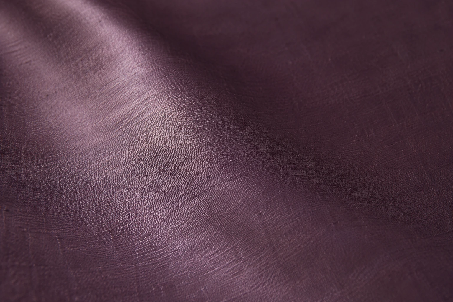
Note whether the bright band is only visible at a narrow angle or spreads across a wider area. Check the same cloth on a flat surface and then, if needed, on a support shaped like the finished part. The front panels of a jacket can sit at slightly different angles and catch the light differently. Keep a flat view and a mounted view. Change one condition at a time so you can see when the apparent colour changes.
Use a fabric edge as a fixed reference. You might note that the pale band crossed the middle in the first view and moved closer to the top in the next. Write down what happened to the plum in the area it left. A broad change around the curve and a small change on the flat cloth may both be relevant. When handing over photographs, show where in the product the curve would be and which direction the light came from. A close-up can locate the reflection, while a wider view shows what the shopper or wearer would see.
Camera settings can change how the two surfaces appear. Automatic exposure may darken the surrounding cloth when a strong highlight dominates the frame. When possible, photograph the swatches together and keep framing, exposure and white balance comparable. If a photograph shows a strong colour difference, revisit the physical cloth under the same light before making a correction request. Keep the images as a record of where and how you looked.
Agree on a shared first light source, for example a defined daylight-type setting. For a second view, choose a light relevant to the product, such as the warmer lighting used in a shop. Change the source and keep the cloth position, grain and backing the same. Compare the tone away from the brightest reflection under each light. If the colours look close under one source and differ under another, record both views. The decision can then reflect the conditions in which the pieces will be seen together.

Keep the first comparison clear of other strong colours. A nearby accessory or lining can affect how you perceive the fabric. If the design needs to match a lining or another panel, add that element to both samples and compare them again. Note which light source was used and the order of the observations. When another reviewer needs to repeat the comparison, share the same set of physical samples and positions.
Changing the viewing angle and the lamp at the same time makes it hard to tell which part of the setup affects the appearance. Compare both light sources with the cloth lying flat, then reproduce the product angle as a separate step. Keep track of a coloured highlight as well as any change in the underlying shade. If the two cloths will meet at a seam on a jacket, bring them together in a comparable mock-up. That lets you judge how the adjacent panels look in the intended grain and shape.
Ask how the spectrophotometer measures the sample. Some sphere instruments can include or exclude specular reflection. The specular component is the directional part of the reflection that contributes to highlights. The included and excluded modes produce values with different measurement conditions. Compare samples measured using the same mode, geometry, face and grain direction. Keep the results from different modes identified if both were requested.
A measurement that includes the specular component can help reduce the effect of a difference in gloss when comparing colour. Excluding it can make differences in surface appearance more apparent in the instrument result. Record which mode was used before interpreting a difference. The change between two colour readings is distinct from a gloss measurement. If the project requires a gloss result, agree on a separate method appropriate for the surface with the supplier or laboratory. Retain the visual product assessment alongside the instrument report.
Use an area that represents the cloth. On a textured surface, one spot may not describe the whole piece. Record where the readings were taken and the orientation of the sample at each point. If you use the same instrument on a later trial, match the aperture, backing and specimen preparation as well as the reporting illuminant. Think of the record as instructions that let someone take the equivalent reading on a new swatch. A numerical tolerance can only be interpreted against a specified method and reference.
Similar instrument results can accompany a visible difference when a product catches the light. Record both. The instrument reading helps answer a colour question under a specified setup. The physical view shows how shade, texture and gloss combine in the intended position. When a deciding patch in the photo lies outside the instrument's reading area, mark both places. This makes it easier to relate the colour report to the visible surface during the next review.
Keep the fabric code, colour, finish, face, grain and light source in the approval record. If the matte reference shares the same base cloth and lot, include that information. A note such as “the shades appear close under diffuse light and the middle of the glossy swatch becomes lighter under a low side light” tells the supplier what to examine. If the less reflective areas also appear redder or greyer, write that separately. If only the sheen needs adjustment, say which part of the reflection matters, such as the intensity of its brightest edge.
When two options match in one setting and diverge in another, identify the view that matters most. For adjacent panels the match at the seam may matter more than their colour names on separate sample cards. Examine that join under the light used for approval and the one likely in the finished product. Keep the sample and a photograph from the normal viewpoint.
If the comparison takes place in different locations, give each team the same physical reference and a description of the backing and light. When a person can review only a photograph, record it as an observation about the image. Have the team with the cloth check the appearance again at the agreed viewing position. Note which area of the sample appears paler and under which source. This gives the supplier a better starting point than a request to reproduce the colour shown on a phone screen.
Where the product has two sides or two panels in different positions, record which position matters for the choice. A match on a flat table may still need checking at the intended seam or curve.
Ask for a revised physical trial and keep the original. If the goal is a softer reflection, request a comparison on the same base colour. If the underlying shade needs adjustment, compare it under the same gloss and lighting conditions where possible. If both have changed, record the new combination. Set up the same viewing conditions again and compare both the shade away from the reflection and the gloss on the finished panel before confirming the update.
phone: +90 212 576 5250
fax: +90 212 493 0336
email: info@unlutransfer.com
Yenidoğan Mah. Eser Sok. No: 6-8
Bayrampaşa, 34030,
Istanbul / Turkey
TR 9150171175
Bayrampaşa Tax Office