For quick contact: +90 532 288 2200


Print small letters, fine open lines and narrow gaps at actual size. Compare the same details on transfer paper, fabric and a sewn sample.
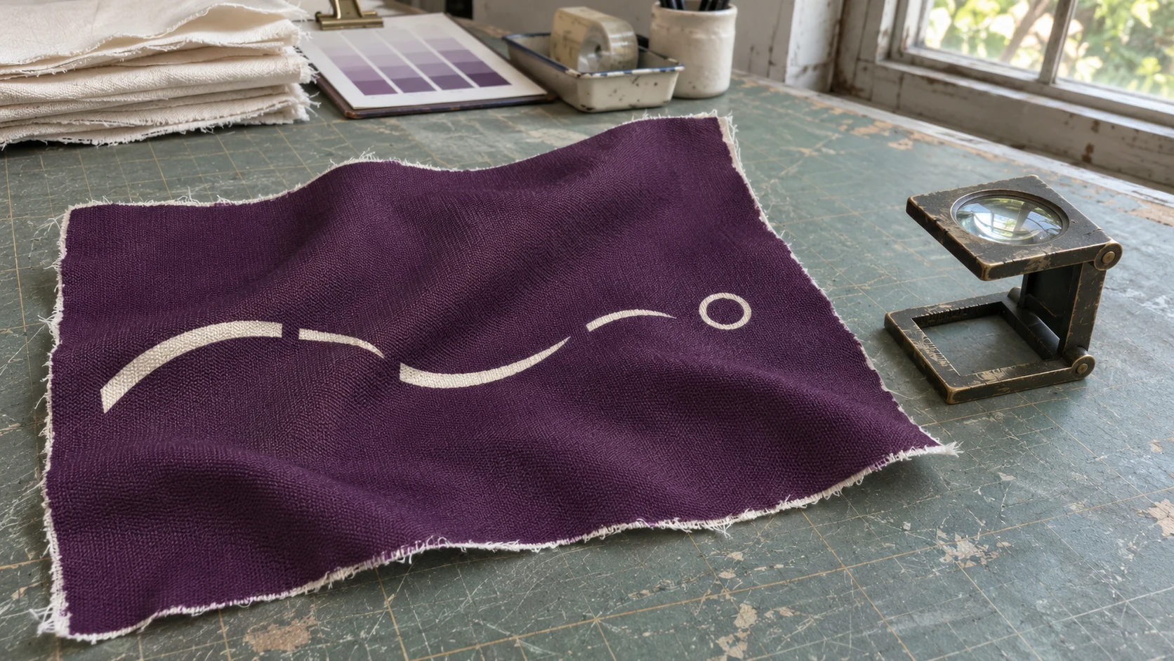
Test small light lettering on a dark sublimation print with a proof strip at its final size, on the actual fabric. Standard dye sublimation uses no separate white ink. Where the artwork leaves the fabric unprinted, the polyester's own shade will show. A dark background in this application is a large coloured area printed on white or light polyester. If the base fabric is off-white, the parts left blank will look off-white too. Their legibility also depends on where the dark print begins around each letter, line or small opening. Check those boundaries on the transfer paper and then on the fabric.
Imagine a size marking printed in pale lettering near the cuff of a purple sports top. Below it is a narrow line that should still be visible once the cuff is stitched. The shape looks clear on paper. After transfer, the opening inside one character is harder to distinguish and the narrow line looks interrupted when the cloth bends. The next trial can address the character, the line and the placement near the cuff separately. This saves time if the main wording already reads well and only one detail needs more room.
One light shape in the artwork may be entirely unprinted. Another may have a printed pale tint or a gradual edge that appears white at normal screen size. Both can be useful, but they produce different tests. On a knockout, the fabric underneath supplies the colour. On a pale tint, the print contributes to it. Retain an unprinted piece from the same fabric lot and lay it against the transferred design. Compare the blank edge and the light area without moving either piece into a shadow.
Show the print team which shapes should keep the base shade. Mark the intended knockout, the pale printed outline and the light end of any gradient on a copy of the artwork. Use a version of the working proof that can be matched to the file that was prepared for output. A note asking for a white line is incomplete when the file contains both a pale tone and an opening. State what the line should look like on the selected base material. The printer can then check which of those details reached the transfer paper.
On fabric that was already dyed dark, an unprinted shape will still show the dark base. If the job calls for a bright mark on that fabric, reconsider the proposed base or discuss a separate decoration method. When the intended background is printed on light fabric, make the proof on the polyester selected for production. Two base whites can look different side by side, especially next to a saturated dark field. Keep a piece of the original unprinted cloth with the artwork proof so the team can trace any change in the base shade.
Take the actual lettering or motif into a small proof strip. Include the surrounding dark print rather than placing the shapes inside an isolated miniature box. Put the current size beside one or two alternatives. For a thin light stroke, make one alternative with the stroke widened and keep the rest of the drawing the same. For a letter with a small enclosed dark centre, test a larger centre separately. Write the actual dimensions in the sample record and label each position outside the printing area under evaluation. The variants should remain identifiable if the strip is cut into sections after transfer.
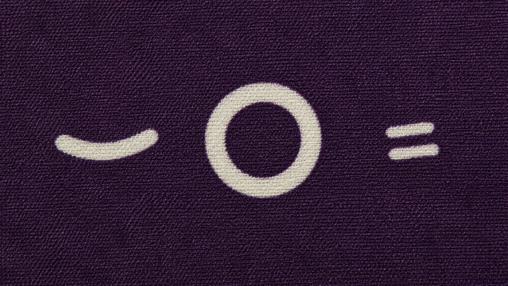
Read the light stroke, the enclosed dark centre and the dark space between letters as different features. Increasing the stroke can reduce the space in the middle of a letter. Spacing the letters farther apart can help them stay distinct, but it may leave the small enclosed area unchanged. Look at which shape disappeared first. If the open centre is difficult to see when the whole line of type is still clear, try a change confined to that part. If adjacent characters seem to merge, test a small adjustment to the space separating them.
Add a positive version of a fine detail if it helps locate the limit. For a light line left open in a dark field, print a dark line of the same nominal width on open fabric. Compare the two near one another. A dark line can look distinct even where the light version is hard to see. In that case, examine the edge of the dark background and the space the line occupies. Repeat the narrow shape across and along the fabric. If a diagonal segment matters to the final artwork, add it at the actual cut orientation.
Give the proof enough length to repeat one or two versions. This can be useful when a sleeve marking will be placed nearer the usable edge and the first proof was run in the middle. Record where the copies occur on the strip and which way they face. If one repeat reads well and another differs, look at the matching sections on paper and fabric before selecting the size. A second trial where the garment actually uses the detail is preferable to drawing a general minimum from a single clean spot.
Check the physical size before printing. A detail that looks clear when enlarged on screen may be barely visible at final size. Identify the resolved artwork version and the paper printed from it. A paper transfer can carry a mirrored image, so orient the two samples correctly when finding the corresponding feature. A simple marker outside the usable design, or a small printed map kept on the sample sheet, helps locate a repeated ring or line. Use the same feature in both readings before deciding where you see a difference.
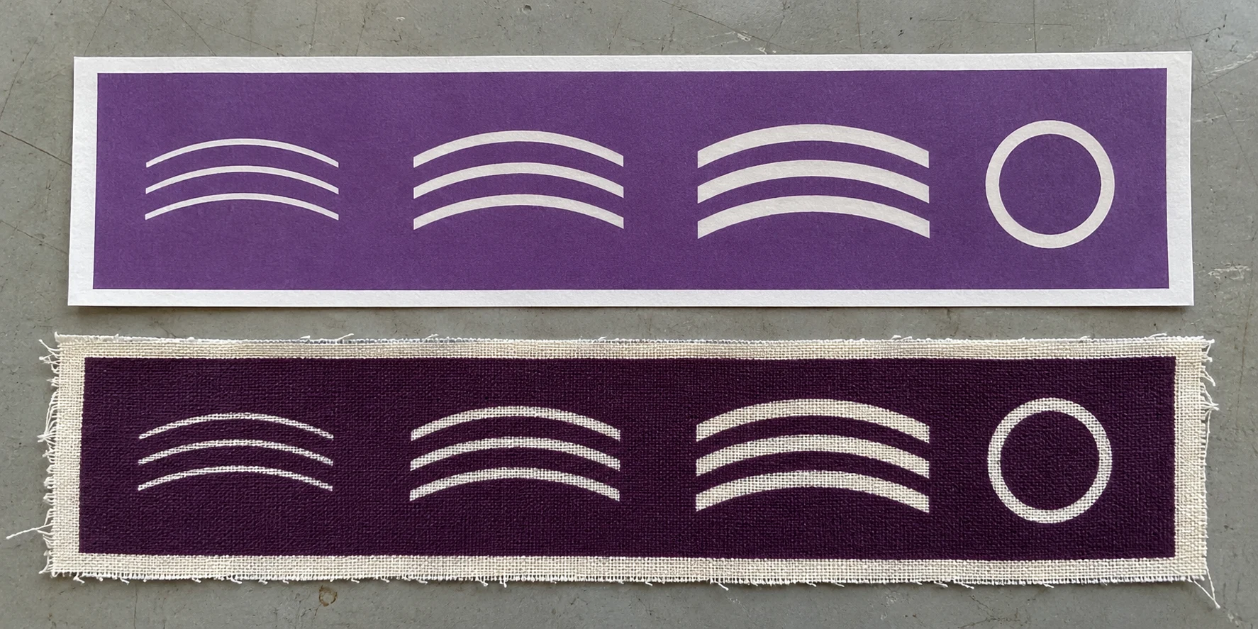
On paper, check the existence and shape of the opening. Look for a narrow channel that has closed, a dark centre that is missing or a line end that stops too soon. For this step, the paper's colour is less useful than the geometry because transferred fabric can differ in shade. If the detail is already absent on paper, check the preparation, file version and output scale first. If it is visible on paper and weaker after transfer, compare the intended fabric and transfer conditions in a new sample. A single change on the cloth can have more than one cause.
Look at the edge in the file as well as in the print. A softened outline can contain pale pixels between the dark fill and an unprinted area. A sharp knockout can leave a defined boundary instead. If you need a new trial to compare the two, keep the width, material and background as close as possible and note which edge treatment went to the printer. If the file was resized at several stages, compare the final output scale with the original sample record. It is easier to interpret the fabric if the versions are kept distinct.
Keep a piece from the first run and change one item at a time in the next one. If the substrate changes from white to cream and the line also gets wider, the resulting improvement or loss is harder to place. Try the two materials with the same shape first, then compare widths on the chosen base. If the dark print itself has to change, keep a copy of the earlier background beside the new one. Compare them in the same light with a blank area in view. This shows what changed in the opening and what changed in the surrounding colour.
If the writing goes on a cuff, pocket or folded edge, look at it assembled or folded in the intended position. Keep the seam line visible. The raw edge can look far enough away while the finished fold covers part of the wording or reduces the space around it. Look at how the dark background meets any neighbouring fabric and what remains visible when the garment moves. A narrow line near a seam may need more room even if it was straight, complete and separate from its neighbours on a test strip.
Make sure the real copy appears on at least one of the samples. A ring can reveal how a fine boundary holds, but it cannot show whether two particular letters are easily confused. Where a design has several languages or size marks, check the smallest and most crowded line in each layout. A dot, accent or thin connection may be important to the meaning. Ask a reader to look at the finished sample under the conditions intended for the product. Observe which part needs a second look, then examine that point more closely.
Decide which details carry information and which are decorative. A size mark must remain clear enough to convey the intended size. A delicate branch line may still give the design the desired look with a slightly soft edge. Read information at the expected viewing distance and judge the decorative element with the rest of the panel in view. Use a magnifier or a photograph to locate a difference for the print team. Make the approval against the product use as well. A bigger stroke can be easy to see under magnification and still look disproportionately heavy on the garment.
Hold the fabric in its expected position when it has a pronounced sheen or when the panel will stretch in use. A fine outline can run into a fold and appear to break while the fabric moves. If two open shapes are on different sides of a sewn join, check them together and note the viewing angle. Record whether the difference moves with the fold, follows the printed boundary or appears at a seam. When the selected design moves to a new panel, return to the actual placement to see whether there is enough space around the letters.
Record the fabric code and lot, the base shade, the artwork version, the approved dimension and the direction used for the test. Note which feature was difficult to read on earlier versions and how the accepted one was checked. Keep the transferred strip with its matching paper and a piece of unprinted fabric. If the design is printed again on a new lot, the team can compare the shade of the base and the shape of the opening from the same position.
Keep marks used to identify trial variants outside the garment artwork. If the layout or artwork changes hands, confirm the file version against the retained sample. When discussing textile printing options, specify the smallest mark that has to read, the background printed around it, the polyester base and the final position on the product. A dimension approved on one fabric and design is a reference for that combination. Recheck it if the background, base fabric or placement changes. A clear record helps both the design and the print team return to the same feature at the next proof.
phone: +90 212 576 5250
fax: +90 212 493 0336
email: info@unlutransfer.com
Yenidoğan Mah. Eser Sok. No: 6-8
Bayrampaşa, 34030,
Istanbul / Turkey
TR 9150171175
Bayrampaşa Tax Office