For quick contact: +90 532 288 2200


Use the screen preview to flag difficult colours, the transfer paper to check the artwork and the finished fabric to make the approval decision.
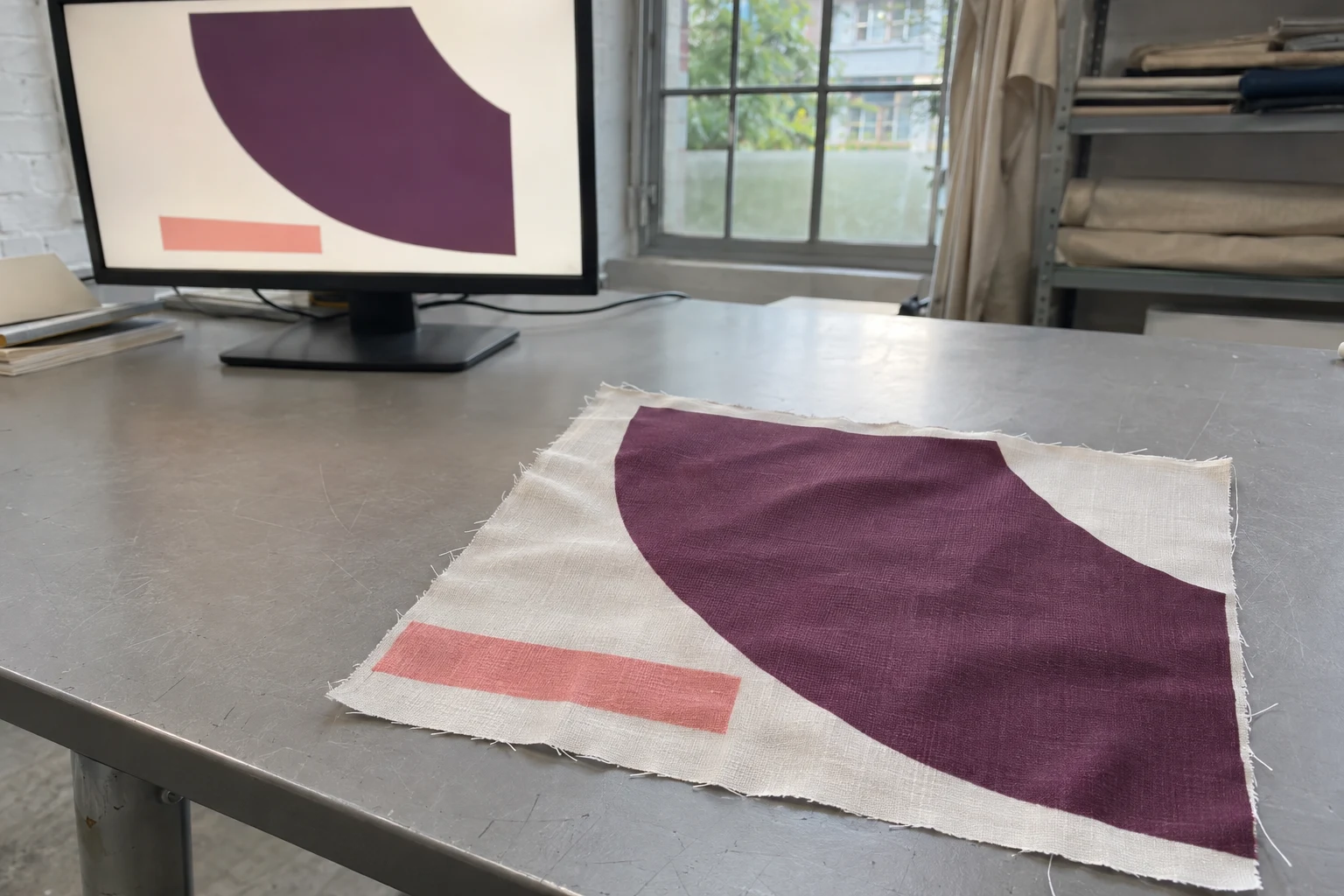
Agree on a colour target and send it with the production artwork. Use a screen proof if a profile that represents the intended printing and transfer conditions is available. Inspect the paper to make sure it carries the right design, then decide on colour with a sample transferred to the actual fabric. The preview helps you choose colours to examine. The paper lets you check the layout and look for visible irregularities before transfer. The finished polyester shows the effect of the full process and the fabric itself. Keep those three observations together in the sample record and say which surface each one describes.
Imagine a sports top with a deep plum field and a pale coral stripe. On a bright display, the stripe stands out. It might look subdued on the transfer sheet and still read clearly on the finished fabric. The printed plum could look right by itself and appear warmer next to the zip under store lighting. The paper comparison answers a question about the printed carrier. The combination of zip and fabric answers a question about the finished garment. Decide which question is still open before asking the printer to change the colour.
Choose the physical reference used for approval. It could be a piece from a previous production lot, a colour card or a component that will sit next to the print. If the zip needs to match the plum, send a sample of the zip. Specify its relevant part if the tape and teeth look different. If an older piece has two versions of the same colour, mark the one you want. A screenshot is useful for pointing out a zone in the design. Its colour can change with the display, the photograph and the surrounding light.
Give the printer the artwork with its colour space and embedded profile, when present, and ask what file format is needed. The same numerical values can describe a different colour when interpreted in a different colour space. Keep track of the source profile and ask the printer where any conversion should happen. If the design was produced by another studio, confirm that the sample file is the actual production revision rather than an image supplied for a presentation. Include the intended colourway and scale with the reference.
State what each colour needs to achieve. The plum may need to be close to a particular physical reference. The coral may primarily need to stay visible as a thin detail next to the plum. A large swatch can help agree the shade. The two colours printed together tell you if the detail has enough contrast. Include both views if the approval involves the shade and the reading of the motif. Where a close match proves difficult, make it clear which colours can move to a nearby alternative and which are critical.
Look at the artwork on a display set up for consistent colour and in stable surrounding light. For a reliable comparison, avoid switching between a brightly lit room and another display with a different white point or brightness. A screen displays light coming from the panel. The fabric's appearance depends on the light hitting its surface. An on-screen simulation can usefully show likely changes, especially when the display and the proof settings are known. It still leaves the fabric texture and physical surroundings for the sample review.
Ask whether the output profile represents the finished transfer onto the selected polyester. A profile describes colour reproduction under a particular set of output conditions. For textile sublimation, the printer, ink, transfer paper and conditions after transfer can all matter to the result. A profile based on a different fabric or process may be useful only as a rough comparison. If the printer has no suitable profile to share, use the display to check file, layout and colour priorities and have the uncertain colours sampled on cloth.
Switch the proof view on and off and look at the colours you identified as critical. A vivid purple might lose some intensity in the simulation. Two neighbouring dark shades can start to look alike. Record where the distinction is important. The preview can help the printer choose which shades to sample near the target. Increasing saturation throughout the file can change colours you already liked without improving the difficult pair. Ask to see the neighbouring shades together on fabric when the separation between them matters.
If different reviewers see different previews, check that they are looking at the same file revision and profile. An image in a messaging app and an output preview in a colour-managed application can be viewed under different assumptions. Agree which physical target will guide the decision before requesting a new colour. If anyone has already converted the artwork, include that information in the handoff to the printer. It makes it possible to find where the views diverged without guessing which screen was more accurate.
When a target appears close to the limits of the output, discuss which aspect of the colour can vary. A supplier might be able to sample a less intense violet that retains its hue, or a darker alternative that keeps a stripe visible. Ask to compare a few practical options rather than choosing from a screenshot. Mark the preferred option beside the original physical reference, so both the initial intention and the feasible production sample remain available.
In transfer sublimation, the artwork is printed onto a carrier and transferred by heat to a compatible textile. The paper and fabric have different backgrounds and surface textures, and they are viewed at different points in the process. Check the printed sheet for the right colourway, orientation, layout and obvious irregularities. Label any comparison with whether it shows the sheet before transfer or the paper remaining afterwards. Assess the final colour on the fabric from that run.
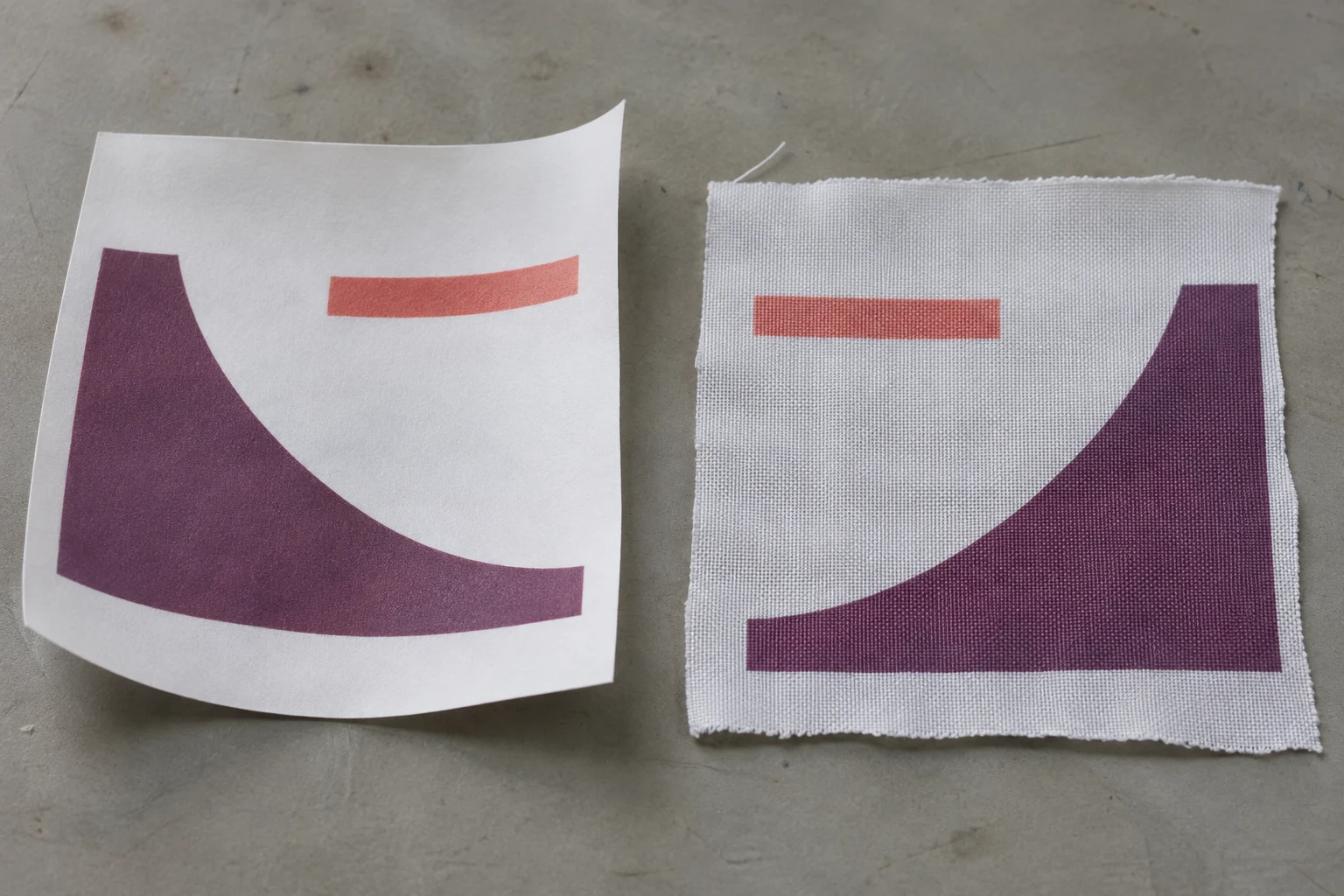
Use the same element on the paper and the fabric for the comparison. If the design was printed in mirror orientation for transfer, an asymmetric curve may face the other way on the paper. Keep the artwork or sketch alongside the two surfaces so the correct features can be matched. If you see a variation on the paper, check whether it repeats in the same location and whether it also appears on the cloth. A mix-up between colourways or a different layout is worth resolving before the fabric colour review.
If the printer changes the paper or ink used for the job, ask whether the earlier proof still represents the new run. Transfer paper can affect what is reproduced on the fabric. A new piece on the intended polyester is a more direct check of the resulting colour. Record any other changes in the same trial. If the paper, fabric and transfer conditions all changed, the two samples tell you what the two workflows produced and give limited evidence about the influence of one change on its own.
Keep the paper and fabric variants linked when you request several shades in one trial. If more than one sample is returned, mark which paper position or production record corresponds to each cloth piece. Compare the same position in the graphic. Identify the paper stage in any photograph you send. This avoids a later discussion about a paler sample when the two people are looking at different stages or at separate shades from the same sheet.
Use the production polyester, the side to be printed and the relevant fabric lot. Two pale base fabrics can make a light coral look different. If the product has a lining and the printed material lets some of the backing show through, use the intended backing in the sample review. Request a broad field for comparing shade and a small detail at the actual width. A coral stripe can look strong as a square and much quieter when only a narrow portion appears next to plum.
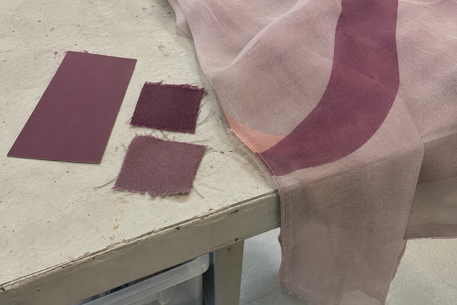
Wait until the fabric is cool and ready to handle, then put the reference and the proof under the agreed viewing light. Check whether orientation or a different backing changes the apparent colour. A textured or reflective fabric can look brighter when the surface tilts. If instrument readings are required, agree on the area to be measured and how the fabric will be placed. Set the relevant acceptance conditions with the people responsible for approval. Use the same presentation on the second round so the results can be compared.
If you request colour options, describe the change and its location. You might find that the main plum looks too warm next to the reference, or that the coral reads as too yellow and disappears where the stripe narrows. Ask for the proposed shades along with the accepted adjacent colour. Small changes in one colour can alter the way the other colour is seen. When you choose a swatch, look at the revised pair in the motif at its final scale before approving the full design.
Bring the zip, lining or companion fabric into the review if it forms part of the match. Two materials may look close under one light and more different in another. Make the formal decision under the agreed light. Then look at both pieces under the conditions in which the product will be used or sold, if those conditions matter. Note which component and light made the difference obvious. A photograph showing the parts and an accurate description of the physical comparison will give the printer a clearer revision request.
Before ordering a revised proof, record what the first one established. You might have confirmed the paper layout and approved the main colour, with only the narrow stripe still open. Mark the affected area on a separate image and send the unmarked production file with the correct revision. Ask for the smallest sample that will answer the question. A wide plum front may require a larger print, while a single coral detail can be checked on a narrow strip at the intended scale.
If one of the production conditions changed, check the critical shades again on the resulting fabric. Specify which profile, fabric or process needs to be brought into the comparison. If you only approved a colour chip, keep that decision separate from the acceptance of the full motif. Retain the first sample until the replacement is confirmed. A fresh sample should show the changed colour and the neighbouring elements that are meant to remain consistent.
Record the artwork revision, colourway, fabric code and lot, target and viewing conditions with the approved cloth. Link the profile or production reference if the printer needs it to repeat the result. Keep a copy of any trim or companion material used to approve the match. If the same file is used for a later order, compare the new fabric with the approved physical sample. When you review the available fabric printing options, include the target colour, the intended polyester and the important part of the motif in your request.
phone: +90 212 576 5250
fax: +90 212 493 0336
email: info@unlutransfer.com
Yenidoğan Mah. Eser Sok. No: 6-8
Bayrampaşa, 34030,
Istanbul / Turkey
TR 9150171175
Bayrampaşa Tax Office