For quick contact: +90 532 288 2200


Check light decorations on dark sublimated polyester after cooling and again after holding. Review colour, opacity and adhesion separately.
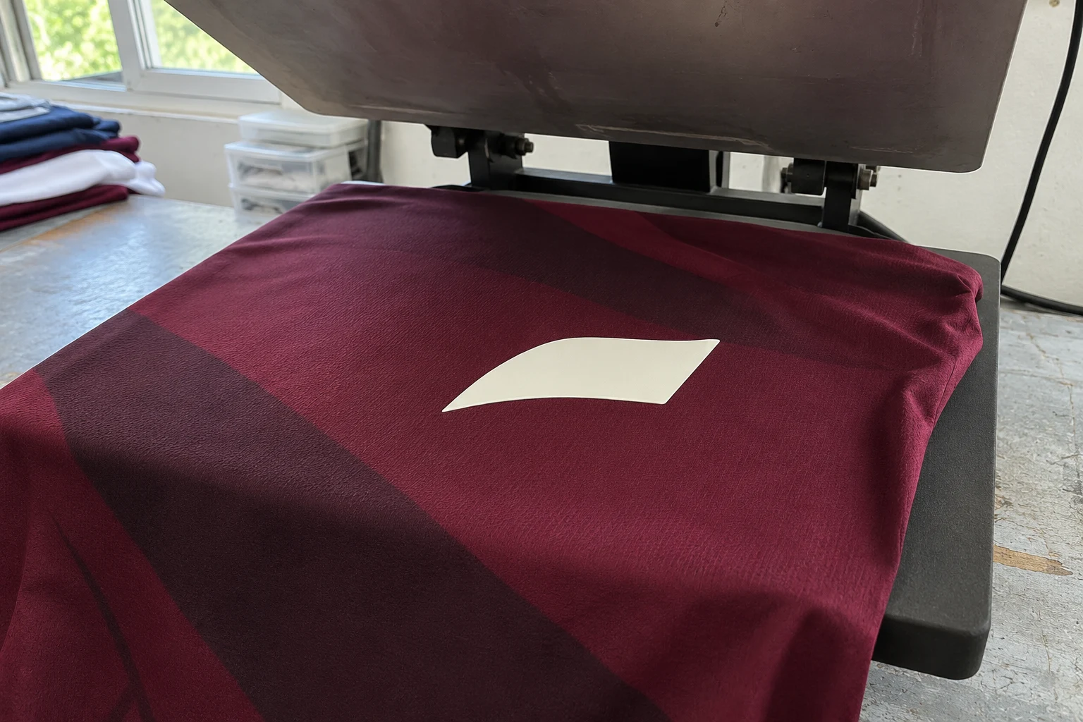
Test before production whenever a white, cream or other light-coloured decoration will be heat applied over a dark sublimated panel. Use the printed fabric, the intended decoration and the application sequence planned for the order. Check the colour once the sample has cooled and again after an agreed holding period. A further heat application can cause dye from the printed fabric to move into the area of the decoration and change its visible colour. A light decoration can also show some of the dark background immediately if it does not have enough opacity. Comparing the same sample over time helps determine which follow-up trial to run.
Imagine an ivory chest detail on a sportswear panel. One end falls on a dark burgundy diagonal and the other on a lighter part of the print. The detail looks even after cooling. Later a faint pink cast may appear where it covers the dark area. If the first check is also the last one, the change may only be noticed after the products have been folded. Prepare a trial that allows a second reading and that includes the most relevant positions in the print. Keep it with a physical reference for the intended light colour.
Place the decoration on a sample from the area it will actually cover. If it crosses a dark band and a lighter ground, include both portions of the artwork. Check the centre and the edge of the dark area as well as the point where the two colours meet. A pale mark applied to a light area of an otherwise dark garment can look even. Approval on that small area gives limited evidence about a decoration with a portion placed directly over a dark motif elsewhere on the same panel.
Record the fabric article and lot, the print position, and the decoration material, colour and size. Keep an unused piece of the light material to help identify its initial shade. View it from the correct side on a plain, neutral support. When fabric for a later delivery comes from a different lot, repeat the check on the planned combination. Compare the printed samples in the same light. Some changes in weave, knit density or surface finish can affect appearance even when the supplier's fabric description has stayed the same.
If the intended decoration goes over a pocket, seam allowance or a second layer, prepare a trial with that construction too. A flat swatch is useful for looking at colour on an uninterrupted surface. A sample with the actual layers can reveal differences in edge contact or sheen. Apply the decoration at the stage planned for production. Use a flat panel if the application comes before sewing, or the assembled area if it comes after. Record where the test piece has extra fabric underneath so the team can locate a change in adhesion or surface shape.
Follow the decoration maker's instructions for the chosen material. Record the application settings, layer sequence and removal of any carrier. If the order includes later heat exposure during finishing, record it too and decide where it belongs in the trial. To examine that step in isolation, use two comparable panels with the same decoration. Let one go through the full sequence and set the other aside after the initial application. Keep both for a comparison after cooling and holding, with a note of the extra operation performed on the first panel.
Once the sample has cooled and can be handled for inspection, lay it flat. Look at the light shape as a whole, then at the centre and edge of the area backed by the darkest print. Inspect the trial in the light used for approvals and make sure the decoration is free of shadows. A small trial patch may be enough to choose which alternatives to test. A sample at the intended size can show how much of the final shape will fall on the dark background and how visible a faint colour difference will be on the finished item.

Look at the same points after holding under the conditions agreed for the order. Choose the timing with the decoration supplier's guidance and the intended handling and storage in mind. Keep the elapsed time and the condition of the sample in the record. If a pink area appears only at the second review, mark where it became visible and whether it follows the dark portion underneath. An arbitrary extra heat treatment changes the trial, so keep an accelerated or deliberately heated comparison separate if the team needs to examine such a condition.
For a photograph that others can compare, place the physical reference and the approved viewing face of the sample in the same frame. Use the same light and background for each review. A phone can warm up or cool down a photograph as the framing changes. Keep the actual samples available for the colour decision. If the photo is used to communicate a problem, show where the decoration meets the two background shades and identify the location in the product drawing. Then the team can put the next sample back into the same view.
If a film offers limited cover, a dark band underneath it may be visible as soon as the sample can be examined. A cast that appears or deepens over time is a reason to investigate dye migration. Timing and appearance provide clues. A colour difference seen at the first check can have more than one cause, and a trial on a light control substrate helps interpret it. Where possible, compare the same pale material on comparable dark and light substrates. Keep the unused white reference nearby and note if the appearance changes across the same printed band between the two reviews.
You can also hold an unused decoration over the two shades without applying it. This quick check helps show how the dark motif might affect the view through the material. The loose piece may have a different backing or structure from the finished application, so keep that observation with the prepared samples. When the pressed decoration shows a dark boundary straight away, see whether that boundary stays stable through the agreed holding period. If colour starts to spread into another area of the pale surface, mark the location and include it in the next comparison.
A light-grey cast can come from the way the surface reflects light. Tilt the sample and see whether the difference moves with the highlight or remains fixed on the same part of the decoration. A mark at the edge of the press or one that appears on both the dark sample and the light control calls for a look at the equipment and the consumables. Record the shape, location and time of appearance. Changing one part of the trial at a time makes the next sample easier to interpret.
If a barrier-backed material is available for the intended use, try it alongside the current option. Place both decorations against comparable parts of the same print. Apply each with the settings specified for that material and record the settings. If they use different conditions, interpret the result as a comparison of two complete applications. A difference in colour may reflect the barrier, the way the surface was produced, or both. Review the results once both samples have cooled and repeat the same review after holding.
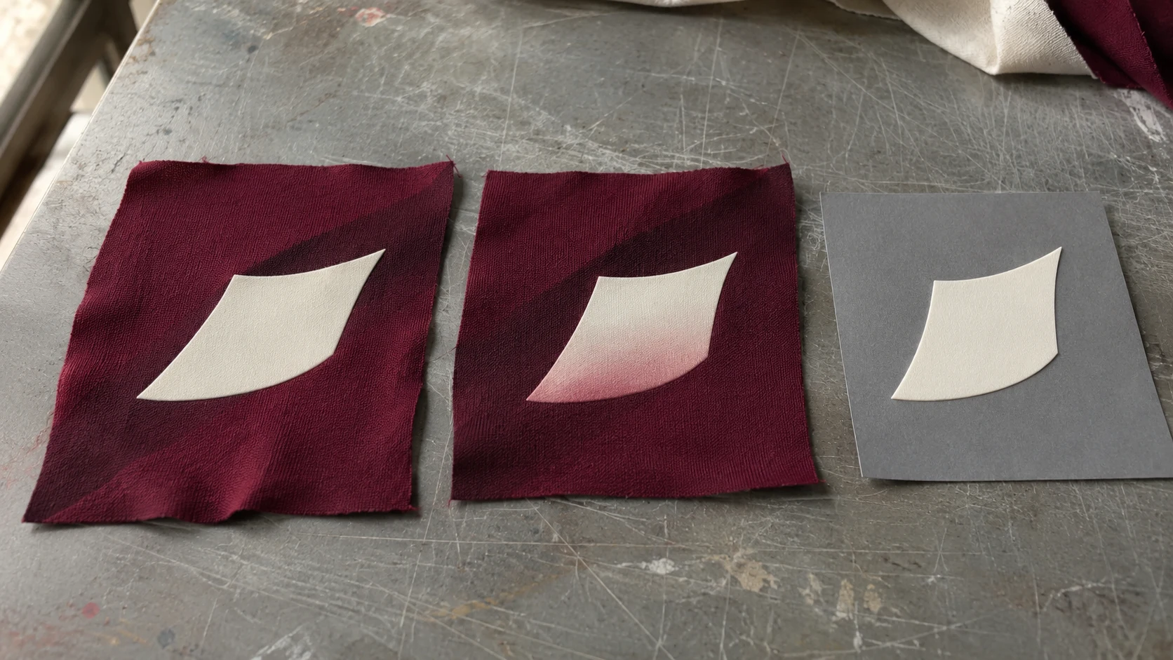
Check adhesion, flexibility and the feel of the decorated spot as well as the colour. A decoration that stays ivory may lift at one edge. Another may hold firmly and develop a rose cast. Record both outcomes, keeping each attached to the sample that produced it. If the garment stretches across the chest or shoulder, check the decoration in the way that part of the garment is expected to move. Stay within the settings specified for the material when trying a lower-heat option. The full application must hold on the cloth as well as preserve the appearance.
Moving the decoration farther from the darkest band is an option if the layout allows it. Check the effect on the shape of the artwork, its distance from seams and pockets, and its alignment on adjacent sizes. Moving the ivory shape into a lighter area might bring it closer to an opening or make it look too close to another element. If you are comparing a different decoration colour, put the new version beside other matching pieces from the collection. Record which position, colour and material went into the revised trial, then compare it with the first under the same light.
If the finished item folds so a second dark panel is against the pale decoration, reproduce that contact in a separate comparison. Keep one sample in the usual fold and another without that contact. Use the intended holding conditions for both and document which surfaces touch. A colour mark where an adjacent sleeve or panel rests calls for a review of the way the product was folded or packed. If a similar change appears on the exposed, contact-free sample, return to the application and holding record. Keep the first view so you can confirm whether both samples started with the same colour.
A drawing of the fold can be enough to explain the difference between the trials. Mark which face touches the decoration and whether the garment was already cooled when it was folded. If only one part of the decoration sits under another panel, compare that section with the open area at the next review. A change in the fold can be tested while keeping the same decoration and fabric. Keep any later care or washing assessment in its own record with the starting condition and method agreed for the finished product.
If the accepted sample has a slight texture or a warm shade by design, keep a piece of the original decoration with it. This gives the reviewer separate references for the supplied material and for how it should look after application.
Retain the fabric and decoration codes, their lots, the application sequence and the two viewing times. Mark the printed area where a difference was found. Keep the accepted pale finish next to the alternative if the team will compare a repeat order or check a change of material. Record the colour decision separately from the adhesion and handling decisions. If the style is made in several colourways, select trials based on the actual overlap of each light decoration with the underlying print. An approval for one combination documents that combination and its application conditions.
When discussing textile printing options, provide the printed polyester, the colour and position of the decoration, and any further heat or packing contact it will see. Agree who will review the held sample and where the physical colour reference will be kept. If a fabric or decoration lot changes, take the new trial and the retained reference back to the same light. Reviewing the intended panel and sequence gives the teams preparing the print, applying the decoration and approving the garment the same sample to work from.
phone: +90 212 576 5250
fax: +90 212 493 0336
email: info@unlutransfer.com
Yenidoğan Mah. Eser Sok. No: 6-8
Bayrampaşa, 34030,
Istanbul / Turkey
TR 9150171175
Bayrampaşa Tax Office