For quick contact: +90 532 288 2200


Compare two preparation options on the same fabric. Assess print edges, colour uniformity, fabric hand and end-use requirements separately.
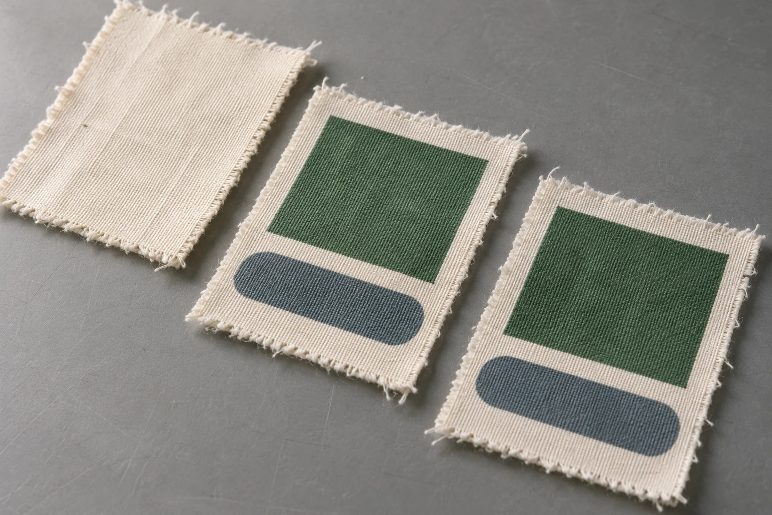
Start with two matching pieces of the actual fabric. Ask the printer to use the current preparation on one piece and the proposed alternative on the other. Print both with the same design and colours. Then look separately at the boundary of a printed shape, the colour within the shape and how the cloth feels and moves. A cleaner edge might matter most on a sharp geometric motif. On a lightweight blouse, the way the printed panel falls may matter just as much. Choose the preparation against the needs of the finished product and confirm the appropriate durability checks before approval.
Pretreatment is the preparation of the fabric before printing. What helps on one job depends on the material as supplied and the ink and production system. A cloth may come with a preparation the printer can already use. A different cloth may need a trial to determine how it receives the ink. When you request samples, ask the supplier to describe the current preparation and the change being proposed. A description such as “pretreated fabric” gives you little to refer to if you need to repeat the job several months later.
Start by looking at the face that will be printed. Fabrics with the same fibre composition can have different yarns, weave densities and previous finishes. A faint lengthwise line, a subtle variation in hairiness or a warmer area of the ground may already be visible before printing. Examine the candidate pieces under the same light and in the same orientation. Mark any feature you expect to recognise later and record which face and direction are intended for production.
Cut adjacent samples from the same roll where possible. If one piece comes from another roll or another lot, record that difference before you try to interpret the print. A warmer natural cotton ground, for instance, may make a pale green look warmer. Laying out unprinted pieces alongside the printed set helps you see whether the difference was there to begin with. If you are concerned about variation across the width, make a matching pair near the edge and another near the centre. Keep a simple sketch of the cutting positions.
Ask the fabric supplier what preparation or finishing it has applied. The description “ready for printing” can mean different things to different suppliers. Tell the printer what fabric you have, what is known about the finish, what artwork you intend to run and how the printed cloth will be used. If the mill cannot confirm a previous treatment, retain a piece of the incoming fabric. It gives you a physical point of comparison even when the paperwork is incomplete.
Give both pieces identical artwork at the intended print size. Include a reasonably large solid area, a transition into a lighter tone and a boundary like one in the production design. A narrow leaf edge answers a different question from a large dark ground. If you can only print one colour in the trial, choose one that matters to the project. The fact that a soft pale tone works well gives you limited information about the appearance of another shade across a broad panel.
Keep an unprinted part of each swatch or hold a separate piece that received the same preparation. These pieces help you compare the cloth itself and feel for differences away from the inked area. If the printer considers it suitable, retain a small untreated piece for observation as well. Treat each comparison piece as what it is. For instance, fabric supplied with an existing finish can be your baseline for this job even if it has already been processed by the mill.
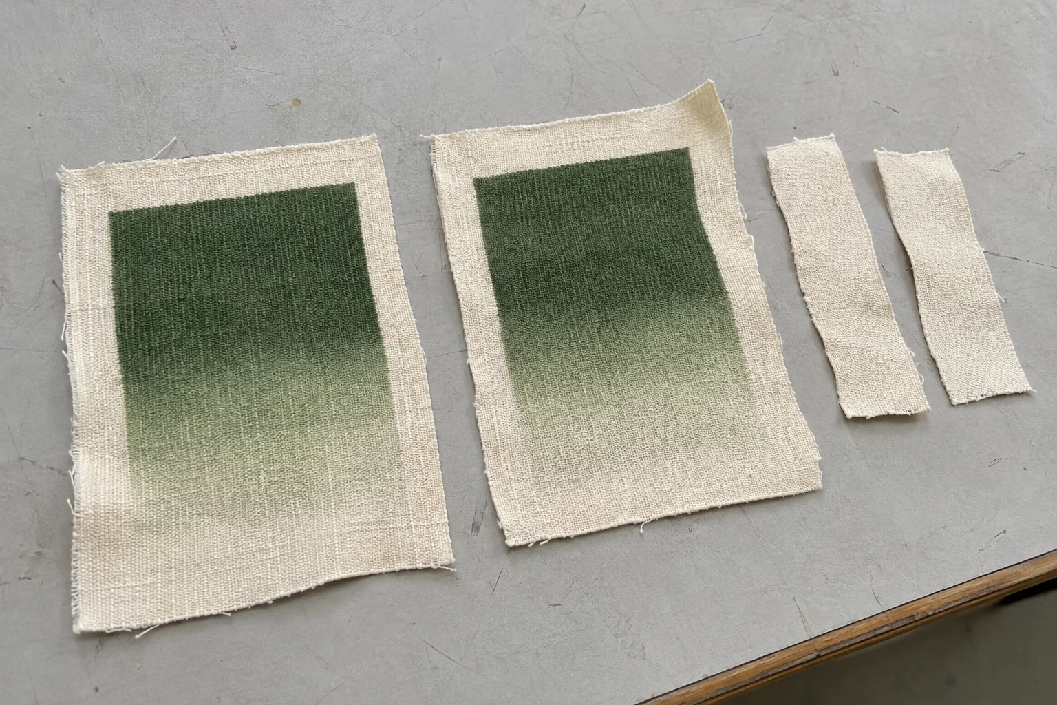
Ask the printer what will be held constant. Two options can sometimes be run with the same print and fixation conditions. In other cases, the printer may need to use the conditions suited to each preparation. That is a valid way to choose between production workflows. Record which other steps changed and read the outcome as the result of the complete workflow. If the samples were produced on different days, ask the printer to identify any other change relevant to the comparison.
Leave spare fabric around the motif and the wide colour area. You may need one section for a later check and another to keep as a reference. Record which part of the card shows the effect you are concerned about. If the solid field looks more uneven close to the edge of the roll than it does in the centre, an unmarked close-up makes it harder to work out which piece the photograph belongs to. A short code outside the printed area keeps the physical samples and the observations together.
Follow the boundary between inked and unprinted cloth. Check whether it reads clearly at the scale of the product and look closer to see where the ink seems to spread. Then move into the printed shape. Is the field even? Does it show small pale points, a directional streak or local patches of different depth? A swatch can have a sharp outline and still need another look at the broad colour area. Give those observations separate entries in the sample record.
Changes in how ink wets or enters the cloth can alter the appearance of the printed colour. A deeper green may look more vivid on the table yet be a poorer match for the target shade. Compare with the colour needed for the actual collection. If the design combines large areas of dark colour and small lighter details, include both in the approval sample. A workflow that gives a good result in one small patch still needs to be judged where colour matters most.

Inspect an unexpected streak in more than one place. See whether it sits over a feature marked on the unprinted cloth. Look for the same effect in another repeat of the motif. If it appears only once, request a second sample of the area or position in question before assigning a cause. The next trial can be small if you identify the question precisely. For example, compare a second centre and edge pair if you want to see whether the mark follows its position across the roll.
Turn the swatches together and see what happens to apparent shadows. Different folds or viewing angles can make equal colours seem unequal. Photograph both pieces in the same orientation and light after examining them in person. If the final fabric will sit over a lining, place both pieces over the intended lining as part of the review. A pale or partly translucent cloth can look different over a dark backing. Agree on the backing and the relevant viewing conditions before judging a small shade difference.
If the project calls for instrument readings, agree where the readings will be taken and how the sample will be presented. A number from a broad solid can help with colour approval. The shape of a small printed edge must still be checked visually. Note whether you used more than one area of the swatch and whether the measured region contained an irregularity that was also visible to the eye.
Handle the two pieces in the same direction. Bend them gently and check what happens where the printed area is broadest. Compare the unprinted pieces from the same respective preparations. If one feels firmer in both areas, ask what changed in the workflow before the ink was laid down or during subsequent processing. If you feel the difference mainly where the print is dense, note the position and ask the printer to review it with the colour coverage and processing conditions.
Decide which difference matters by picturing the actual part. For a seam that must bend along the edge of a print, test a small shaped piece. For a light panel expected to fall in soft folds, hang matching pieces in the same way. A small variation in firmness might be acceptable in a structured cuff and noticeable on a loose front. Make those priorities clear to the people reviewing the sample so they can compare the same thing.
Use the relevant rub or care checks to judge performance on finished fabric. An attractive surface gives you the appearance information you need. If the printed cloth touches a light lining or garment panel, ask that the check account for the intended contact and use. Describe where the materials meet and what the product needs to withstand. Agree with the supplier on how the checks apply to the article before approving the workflow more widely.
Ask when each sample was cut and sent. One may have been pulled just after printing while the other travelled through fixation and finishing. Treat those viewings as observations at different stages. Judge the final hand and appearance on pieces that are at the stage at which the production cloth would be delivered. If the garment maker will press, fold or sew directly over a large printed area, request a representative assembly or discuss how to check the effect of that operation.
Unfold both samples before comparing. A sharp crease can reflect light or put part of a colour field in shadow. For the first view, compare similar flat areas. For a second view, fold or hang them as the finished product will be used. State which view mattered to the decision. A colour difference that appears on the table and an effect that only becomes apparent when a panel bends are observations a printer can investigate separately.
Scale up the test when the first swatch cannot answer the practical question. A small card can reveal whether the edge of a leaf reads clearly. The same card may be too small to show how even a full front panel looks or how it hangs. Once you choose a likely option, ask for the smallest piece that includes the full area or movement you need to assess. Keep the details already accepted on the first card with the request.
Suppose the original preparation gives a soft outline on a green leaf, while the alternative has a crisp edge and a mottled interior. First confirm that both prints came from the same file and that the green shapes sit in comparable areas of cloth. Look at the unprinted piece to see whether the mottling was visible before printing. If the ground is even and the difference appears only in the colour, ask the printer to repeat that solid field and comment on any other processing change.
If both options look equally good, use the weave, product construction and end-use checks to decide whether another trial would add information. Check that the motif and the colour tested were representative. A pale detail may never reveal the issue you are concerned about in a large dark shape. If the right part of the design has already been tested and both options meet the visual and use criteria, focus the discussion on which workflow the printer can repeat for the next lot.
Retain the approved print and a matching unprinted piece. Record the fabric code, lot, printed face, artwork revision, supplier's preparation and relevant finishing conditions. Write what you saw at the boundary, in the colour field and where you handled the cloth. If a future lot arrives with a changed ground shade or finish, use the two retained pieces to work out which part of the approval should be repeated. When you review digital fabric printing options, share the production artwork, the known history of the cloth and the area of the product that needs the closest attention.
phone: +90 212 576 5250
fax: +90 212 493 0336
email: info@unlutransfer.com
Yenidoğan Mah. Eser Sok. No: 6-8
Bayrampaşa, 34030,
Istanbul / Turkey
TR 9150171175
Bayrampaşa Tax Office