For quick contact: +90 532 288 2200


Test printed lines and unprinted gaps in different directions on the production fabric before approving the smallest details in your artwork.
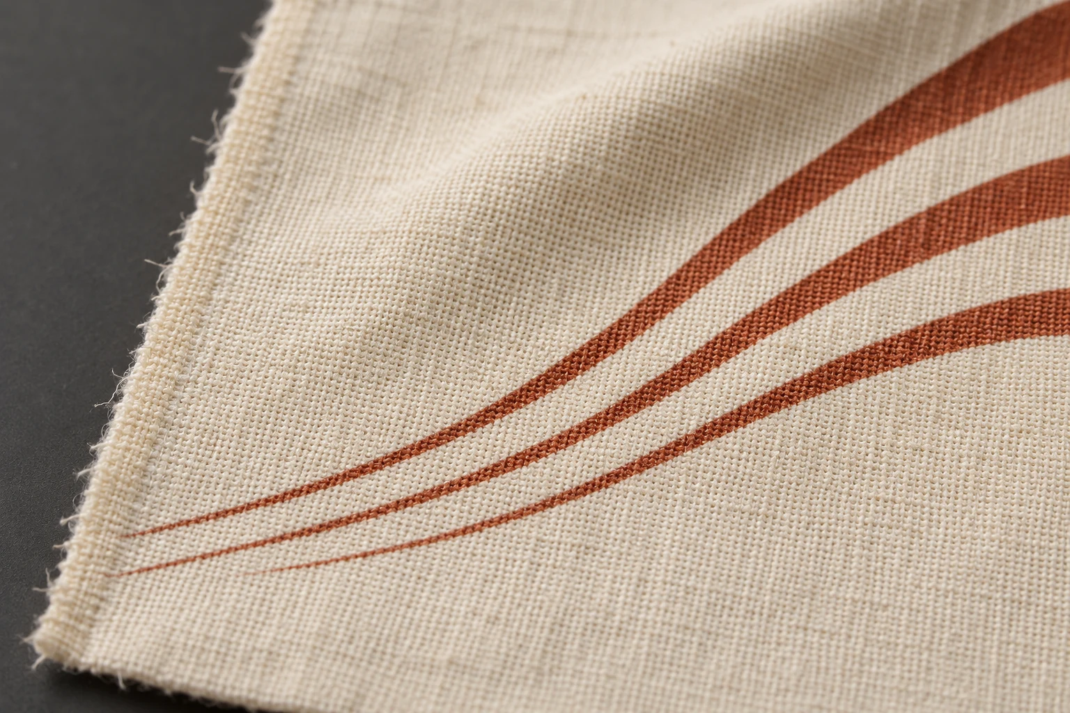
Test the finest details on the fabric you intend to use. Include both printed lines and small gaps that should stay unprinted inside a solid area. Try a short range of widths along both principal directions of the cloth and at the angles used in the motif. Then check three things separately. Does the printed line stay continuous? Does the unprinted gap stay open? Can someone read the motif from the distance at which they will normally see the product? The answers tell you which part of the artwork to adjust before you approve the sample.
Think of a narrow belt, a blouse covered with tiny leaf veins or a flower drawn in fine outlines. At high magnification on a screen, the smallest details may all look clean. On fabric, the edge of a line may follow the crossing yarns and appear slightly uneven. A narrow pale gap between two dark marks may read as one dark area. Your decision depends on what that detail does for the design when it is printed at its final size on the chosen cloth.
An unprinted gap in an area of colour can look like the inverse of a coloured line on a light ground. In a print sample, the two details can fail in different ways. A fine line can break in several places. An open gap of the same width can close visually as the printed areas on either side meet. A successful line on the sample card gives you information about that line. Test the open gap directly on the same cloth.
Consider a small terracotta leaf outlined in dark ink. The outside of the leaf may remain clear while the unprinted vein in the centre disappears. The outline can look acceptable at first glance, but without that vein the leaf reads as a different shape. For a border of parallel lines on a scarf, the first question might instead be whether the closest two lines still look separate. Name the detail that matters before setting out the test.
A line can remain physically continuous and still be hard to distinguish from the ground. With low contrast, the fabric texture and the mark may appear similar in tone. In a dark colourway, a partly closed gap can make the surrounding border look heavier. Check the line and gap under consistent light. Then look at the actual colourway from normal viewing distance. A high-contrast trial makes a detail easier to find, while the intended colours tell you whether it will be legible in the product.
Woven cloth is made of crossing yarns with small gaps, raised intersections and local shadows. The interaction between ink and fabric can change with the print system and surface preparation. Lines of equal width in the file can therefore appear different on two fabrics or in two directions on the same fabric. Which direction looks cleaner depends on the construction and the process. Print both directions for the particular combination you plan to use.
When comparing a plain weave with a more pronounced surface, look beyond the fibre label. Yarn thickness, weave and surface hairiness can differ even when the fibre content matches. Two fabrics that seem equally smooth can also have different preparation histories. Print the same artwork details on both candidates. If you use a similar fabric for the initial trial, label it clearly and run the final check on the actual production cloth.
Identify the lines that run parallel to warp and weft. Add a diagonal or a curved piece of the motif when the artwork uses those directions. A straight section can look clean while a tight turn becomes difficult to read. In a curved motif, the direction keeps changing along the outline. Include a real-size section of that curve along with the straight samples so that you can find the weakest part.
On a stretch knit, begin with the fabric relaxed. Then take another look at the stretch you expect during use, if that is relevant for the garment. A wave can look thinner when stretched in one direction. When the fabric relaxes again, a small gap may be harder to see. These observations answer separate questions about the print as it comes off the line and the way the motif moves on the body.
Find the narrowest meaningful details in the final artwork. They might be an inward curve, a space between parallel lines or a small corner. Build a series in which widths change in steps. Put coloured lines on open ground in one group. Put unprinted openings inside a solid block in a second group. With the examples side by side, the printer and designer can see which change first makes a visible difference.

Write the widths in the artwork record and keep the version that was sent to print. An accompanying layout can identify each row without relying on tiny text printed beside it. Mark the direction of each group. If the collection uses the motif at several sizes, add its smallest actual application to the card. This puts the real production decision next to the comparison strips.
Repeat the width series in both principal directions. Add the relevant curve or diagonal at the size it will be used. Leave enough room to assess narrow marks on open ground and openings in the solid area independently. If the collection hinges on an especially light or dark colourway, run that colourway in a separate part of the card. The layout then helps you keep colour contrast and print direction distinct in the review.
Tell the printer why a particular detail matters. If a line divides the petals of a flower, a break may change the way the whole motif is understood. Losing a tiny shadow line of the same width might have little effect. Mark the details that carry the design before you order the trial. The smallest feature on the page and the smallest feature the product needs are often in different places.
Compare the working artwork with the exported file that you will send to production. A design view may show a smooth line while a small export changes the shape of its corner. Transparency, a pale colour assigned as a separate print area or a later change of scale can also affect the detail. Check that the areas intended to remain unprinted are genuinely open in the production file. Correct any visible issue in the export before you use a fabric sample to investigate it.
A smooth screen preview and a correct physical size are two separate requirements. Give the printer the finished dimensions and direction when you send the card. Recheck any uneven scaling that could change the stroke widths. If the motif will appear across a large panel and on a narrow strip, identify the two applications separately. Print the smaller version at its actual size when it will be scaled again during preparation.
Use the exported file alongside the swatch during the review. If a gap is open in the file and closed on cloth, record that difference. A rounded corner that appears in both may have started in the artwork. When a gap is clear in one position and closed in another, look at the direction and the location on the fabric. These comparisons help you decide whether to revise the file, adjust the sample layout or discuss a new production trial.
Start with continuity. Can you follow the line without losing it at several crossings in the weave? Next look at the edge. A continuous line may still look uneven or spread into a neighbouring area. Finally, look at the open gap. Does it close in one place or repeatedly in the same direction? Write the observations in separate fields. This makes it easier to agree on which part the next trial needs to improve.

Look first with the naked eye at a consistent distance and then use a close photograph. The close view helps show the edge. Step back to the distance from which somebody will normally see the item. An irregularity visible only in magnification may have little effect on the whole design. A pair of marks that merges at normal distance can change the motif even if the separation is visible up close. Save both views when the difference affects the decision.
When the two directions look different, confirm how the sections are oriented on the card. Check whether another line in the same direction has the same issue. If the result is cleaner elsewhere, the immediate cause may also involve the local fabric surface or the sample conditions. Compare a second equivalent detail before assigning the difference to one cause. For a repeating print, match a copy near the edge with the same detail near the centre when the position may matter to the cutting plan.
If a line appears faint while its width and gaps stay consistent, check shade and lighting first. If an open gap closes while the outer outline stays legible, examine the shape of that gap and the print on either side. Increasing an adjacent stroke may close the opening further. Separate decisions about lines and openings make the next revision easier to judge.
If the next wider opening stays clear, try increasing just the critical gap. For a line that breaks, try strengthening the narrow section or easing a tight corner. Keep the cloth, direction and colour group comparable when you make the next trial. When several conditions change together, such as the cloth and artwork, it is harder to see which one restored the detail.
Sometimes a feature is fixed by garment size, a matching panel or a collection motif that needs to keep its scale. Send the original file and the physical swatch with the detail clearly marked. If you are exploring a different fabric or process, ask for the same artwork on the next sample. Revisit colour, hand and the relevant use requirements when changing the ground alters the appearance of the print.
Include the cutting location where the same print goes on a narrow part. A fine line near an edge can disappear into a seam. A beautiful result from the centre of a sample card may tell you little about a part that will be cut at another angle or placed close to the seam allowance. Use a small sewn piece to check the actual location before reshaping the whole motif.
Suppose a blouse uses a small leaf made from two dark outlines and an open central vein. Both outlines are readable on the first card, but the vein closes in one direction. Open the vein in the next version, then print it again in the same colour and at the same size. If the outlines stay distinct and the vein reads in both intended directions, you have retained the detail that gave the motif its shape.
A wider vein that looks clear in a close-up may make the leaf seem split when seen on the blouse. Look at the revised motif on a panel at normal distance. Try the panel both flat and hanging. If the openings seem to change as the cloth moves, record where and how that happens. This can help you keep the repeat and cutting plan and change only the part of the motif that needs it.
Record the file revision, fabric code, print direction and selected line and gap sizes with the sample. Include both the close view and the whole motif at normal distance. Revisit that record if the artwork moves to another fabric, another size or a colourway with less contrast. Explore digital fabric printing options and include the full-size file and the critical detail in your sample request.
phone: +90 212 576 5250
fax: +90 212 493 0336
email: info@unlutransfer.com
Yenidoğan Mah. Eser Sok. No: 6-8
Bayrampaşa, 34030,
Istanbul / Turkey
TR 9150171175
Bayrampaşa Tax Office