For quick contact: +90 532 288 2200


Set a common design target, approve a physical sample for each fabric and compare the finished pieces in the combinations the collection will use.
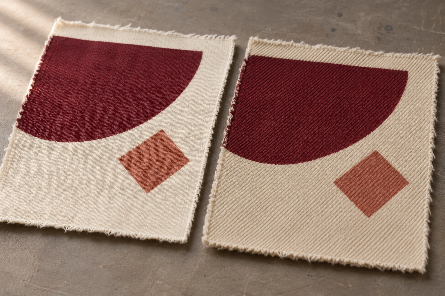
Approve a separate printed sample for each production fabric. Start with the same artwork and compare each result with a shared design target. Look at the key colours and check whether the shapes are still legible on each surface. Then bring together any pieces that will be sewn together or presented as a set. You may approve each piece individually and still need to resolve how they look next to each other. Keep the finished print, the fabric record and the corresponding artwork revision together for each material.
Suppose you plan to use burgundy semicircles and smaller clay-red diamonds on two garments. One will be made in fine ivory cotton poplin. The other uses a warmer cotton twill with more visible texture. The burgundy may read as a more continuous field on the poplin and show the direction of the yarns on the twill. A pale clay-red accent may sit closer to the warmer ground. The decision depends on what that colour and shape are supposed to do in the collection. Decide which elements must look consistent and where a different effect is welcome.
Confirm the reference, construction, composition and finish of each fabric. Two fabrics with the same fibre content can have different yarns, weave, ground colour and surface finish. These features can change how light reaches the eye and how the print appears. Write the supplier's fabric code on each sample. Record the lot and show the face intended for printing. Descriptions such as “light cotton” can become ambiguous when a sample card is handled by several teams or used again months later.
Ask for the same core part of the motif and the same colour fields on each fabric. Include a broad area of colour, a piece of the pattern at the proposed size and some unprinted ground. If the printer needs to prepare or process the two fabrics differently, record those differences. Comparisons made under realistic production conditions are useful for choosing the finished fabric and print together. If several factors change across the samples, record the appearance for each complete workflow so a later decision does not depend on the texture alone.
Compare the base fabrics beside one another before judging the printed areas. One can appear warm and the other slightly cooler. If the cloth is sheer enough for its backing to matter, use the intended lining to see how the piece will look in the product. A light colour printed on ivory fabric may appear different with a dark layer beneath it. If the company mounts samples on a white card, also inspect the actual fabric as it will be used. The mounting can make a small colour difference harder or easier to see.
Where the same artwork has several colourways, list the fabric and colour combinations you actually need. Perhaps the burgundy set uses both poplin and twill, while a green version only appears on the poplin. Tell the printer which combinations are for a first trial and which must be coordinated in a finished product. A useful request states the fabric, intended scale, colourway and purpose of each swatch. Reviewing every colour combination on paper adds little if the team cannot map the selected swatch back to the cloth on the order.
Identify colours that must look closely related across both fabrics. The deep burgundy could tie two garments together. A pale clay-red may have a different job, such as remaining visible against each background. Write the purpose beside each colour reference. This gives the printer and designer a starting point if the result appears warmer on one cloth, cooler on another or weaker only where the motif gets small. You can then adjust the colour that affects the design and preserve the areas already accepted.
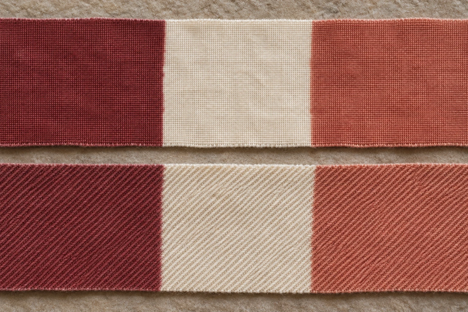
Set out both samples in the same orientation and under the same light. Compare a broad printed field with the approved physical target. Then look at the same colour inside its actual motif. A large patch makes it possible to see the shade and texture clearly. A small accent has to compete with the colours and shapes around it. If the pale accent looks satisfactory on its own but no longer separates from the ground in the finished pattern, record the difference in terms of the actual design.
Turn the two pieces together to find out whether visible differences vary with the direction of the cloth. Compare the unprinted areas if the twill looks warmer. The base shade, the way the fabric reflects light and the appearance of the print may all contribute to the difference. Give the printer a sample with the area marked and a description such as “the burgundy on the twill reads warmer in the finished assembly.” A request tied to one fabric and one zone is easier to act on than a general instruction to match another print.
If the project requires colour measurement, agree on how to present the sample. Specify the backing, number of layers and areas to be read where these variables matter. Discuss with the people responsible for approval how they will account for weave direction or a textured surface. An instrument reading can help compare a colour field with a defined target. You will still need to look at the shade within the motif and at the place where two materials will be seen together.
The second set of samples may offer more than one shade on each cloth. Label each option with the correct fabric and colourway, even when the printer uses the same shade name for both. If you select the second burgundy for twill and keep the original on poplin, mark both decisions and show which pieces belong together. Retain the alternatives until the selection is clear. A mislabelled chip can send the right colour decision to the wrong production fabric.
Look at the print at the intended size and at the distance from which the product will normally be seen. Identify an element that gives the design its character. You might need two large shapes to remain distinct, a small diamond to stay visible or a repeat to line up around a join. A satisfactory match in the main colour field tells you how that colour looks. Read the actual motif to decide whether the scale and contrast still serve the design on each cloth.
Check one full repeat and then a larger area if what happens across the garment affects approval. Suppose the clay-red diamond reads on the poplin but nearly merges with the ground on the twill. One diamond may still be visible when you look closely. Across the full panel, the burgundy shapes may seem to dominate because the lighter accents no longer create the same rhythm. Ask whether the project wants that change. If you want to keep the balance of the first sample, test a revised accent colour while keeping the accepted burgundy as a reference.
Different cloths can give an intended difference in appearance. A soft shirt may call for a quieter contrast, while a piece cut from firmer cloth may use a more distinct pattern. Confirm that both outcomes meet the design brief. If the two products are meant to look closely coordinated, make their shared colour and contrast requirements explicit. For a deliberately different version, keep an approved sample that makes that choice clear to the printer and the team placing the order.
For separate garments in a set, compare the materials as the two pieces will be worn or presented. For two panels in one garment, align the intended edges and grain directions. Put the lining or backing in place where the construction calls for it. Start on a flat surface, then hang or bend the panels as appropriate. A small difference on the sample table can become more or less obvious when the materials meet on a curved part of a garment.
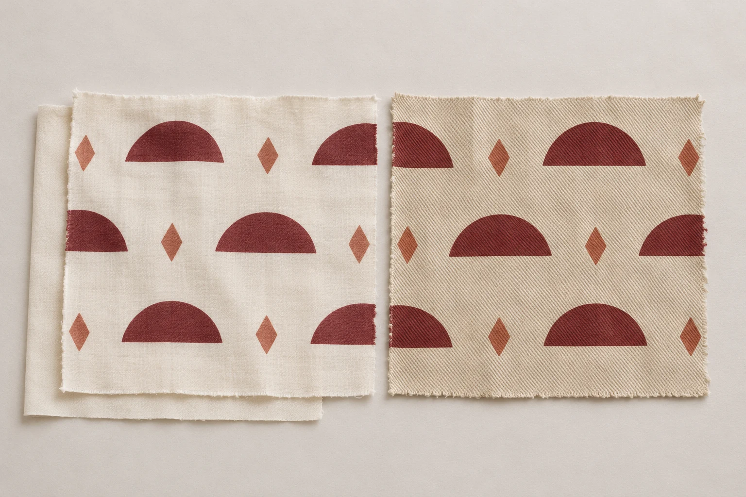
Imagine that a warm twill skirt will be worn with a poplin top. The prints may be close enough when reviewed separately. If the burgundy areas at the waist sit next to one another, the red on the twill might read warmer. Bring those exact parts together before deciding whether a change is necessary. If only the coordination is unresolved, preserve the accepted motif and focus the second trial on how the shade relates to the matching garment. Mark the pairing on the request so the supplier knows which physical references to use.
When a motif crosses a sewn join, arrange a small assembly sample. Place the pieces in the finished direction. A panel rotated during cutting can show the surface differently and alter how the two colours look where they meet. Check the position of the half circles or other shapes relative to the seam. The flat print sample remains useful for comparing colour. The assembled sample shows whether the repeat, spacing and adjacent colours meet the intended arrangement.
Carry out formal colour approval under the agreed light. When the relationship also matters in a shop or other known setting, look at the two pieces together under lighting representative of that setting. Record if a difference becomes more visible under one condition. Attach that information to the photo and the matching samples. An observation that identifies the two fabrics, their orientation and the light in which a difference appears gives the printer a clearer basis for the next round.
A fabric may be ready for individual approval before the matching material arrives. Record that the colour and motif have been accepted on the available fabric. Leave the paired review open until there is a sample of the other one. When it arrives, check it on its own and then against the approved piece. This helps prevent a purchase order for the combined product from referring to an approval that covered only one component.
For each fabric, retain the finished sample and note the design revision, colourway, fabric code, lot and relevant print or finishing conditions. Record what was accepted. For example, the main burgundy is confirmed, the clay-red accent separates from the ground with the lining in place, and the twill must be cut in the sampled direction. Include the lining reference if it influenced the appearance. A photograph can show which colour field or motif sits on the card, and the physical sample can be used again for colour comparison.
Keep fabric-specific production files identifiable. If an adjustment only applies to the twill, name the revised file so it can be linked to the twill sample and the record of the printer's settings or profile. When you place a repeat order, send the file reference together with the expected fabric and approved sample reference. If a new lot has a different ground shade or texture, start with the unprinted cloth, then check the key colour, full-size motif and any pairing that matters. When you review fabric printing options, send the fabric and colour combinations, the artwork and the intended product assembly with your sample request.
phone: +90 212 576 5250
fax: +90 212 493 0336
email: info@unlutransfer.com
Yenidoğan Mah. Eser Sok. No: 6-8
Bayrampaşa, 34030,
Istanbul / Turkey
TR 9150171175
Bayrampaşa Tax Office