For quick contact: +90 532 288 2200


Compare fine and coarse glitter on the actual cloth, checking which strokes, gaps and corners survive at the intended print size.
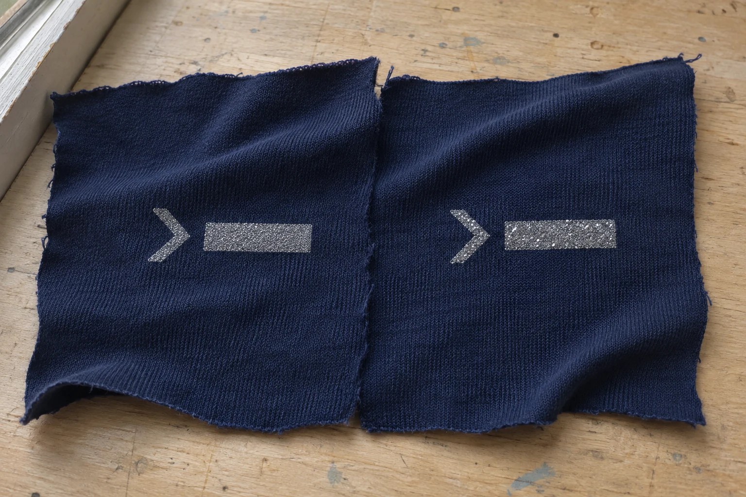
Fine glitter can give narrow screen-printed lines a more even appearance, while a coarser grade can yield more distinct flashes and a grainier outline. The result depends on how the flakes pass through the screen, the print base and stencil, and the fabric itself. To choose a grade, print both candidates on the intended cloth at actual artwork size. Include a broad shape, the narrowest meaningful stroke and a corner or a gap that must stay visibly open. A broad area can show the sparkle you want, while the tight detail shows whether the same grade can carry the shape you need.
Imagine a silver chevron beside a short solid bar on navy jersey. The bar has enough space to show distinct bright points from the coarser particles. At the tip and along the edges of the chevron, a few conspicuous flakes can influence how smoothly the shape reads. A finer grade may give a more even outline while producing a different effect across the solid bar. Decide what needs to hold up in each area. If the chevron must read clearly at a normal viewing distance, establish how much navy fabric needs to remain visible inside it. If the broad bar is meant to flash when it moves, review that effect separately.
Ask what the supplier means by fine or coarse for the material under consideration. Trade descriptions are most useful alongside the actual product code, the stated particle size range and, where relevant, flake shape. A blend can contain particles larger than its typical size. Those larger pieces matter when the printer checks the opening through which the mix will pass. If your purpose is to compare two sizes of silver glitter, start with paired shades or note the differences between the available options. Otherwise an undertone or finish can influence the choice at the same time as the particle size.
In screen printing, the ink or paste passes through mesh where the stencil leaves the design open. Mesh count tells you how many threads are present over a stated length. The opening available for particles also depends on the diameter of those threads. Ask the print team to confirm the opening and stencil appropriate for the selected glitter and print base. A larger flake grade can require a larger opening. The answer for a particular ink, mesh and stencil belongs with the supplier's product information and a trial on the actual fabric. A mesh count that suits one grade cannot establish what another grade will reproduce.
Particle passage and artwork reproduction are two parts of the proof. An opening that allows the coarse flakes to pass does not automatically preserve a small gap or give a narrow line the edge you are after. Stencil geometry, the behaviour of the paste near the edge and the texture of the cloth also contribute. Review the straight line, the open corner and the broad area on the same proof sheet. Record both the print system and the artwork that produced the sample. If a gap closes while a bar prints evenly, the proof gives the team a specific place to examine rather than a general complaint about the entire print.
Where both grades can be used in a common compatible base, that makes a direct comparison easier to interpret. Where the supplier or printer specifies a different base for each grade, keep the appropriate base with each one. The comparison then shows how two viable combinations look on the same cloth. Record which material was paired with which grade. If the sample prints of similar silver look different, the base and the shape of the flakes may contribute as well as size. Check the same location in the design on both samples before assigning the difference to a particular feature.
Prepare several straight bars of decreasing width and include the width that will be used in the finished motif. Add a gap of the intended width between two printed areas and an open angle like the inside of the chevron. The straight bar checks whether a line stays visibly continuous. The gap asks whether there is enough bare cloth to keep the two printed shapes distinct. The angle puts both concerns into a smaller space. A clean line on its own does not show how well a narrow inside corner will survive. Keep the three types of detail close enough to compare under the same light.

Add part of the actual artwork if it is more demanding than a simple line. If the motif contains lettering, include the enclosed space in the smallest relevant character and some of the surrounding word. If the line must follow a curve, include the tightest turn that will appear on the product. Bring a view of the artwork at the intended scale to the review. It helps the team tell whether the printed outline follows the drawing and whether a shape has disappeared because of its scale or is simply difficult to see against the cloth.
Keep a piece of the broader print next to the smallest motif. An even spread of small flakes may look subtle in a wide area. Coarser particles may catch the light individually, which may be the desired effect for that area. Write down how the broad patch and the small motif perform separately. If the broad bar appeals but the corner loses its opening, keep that information for the next decision. It might lead to a wider corner on a print made with a single glitter grade, or to a sample that tries different grades for two parts of the design.
For a motif that repeats in different directions, put two lines of the same width across the knit or weave in those directions. A horizontal stroke on jersey may follow a row of stitches while a diagonal one crosses several rows. Grain and reflection around the edge can influence how each stroke reads. Mark the fabric direction on the reverse. Check the samples while aligned, then rotate the whole group. A pattern that becomes hard to read only when the light changes suggests a different follow-up from a mark with a persistent missing section along one side of the design.
Lay the two samples flat in an evenly lit area and look at the same feature on both. Follow the narrow line from one end to the other. Check whether a grainy edge still leaves a continuous printed shape and whether you can see the bare cloth inside the intended opening. Now tilt both pieces together. Reflections from individual flakes become more visible at some angles and less visible at others. An edge that seems brighter when one part catches the light can still have the same physical footprint. Start with the more evenly lit view so you can read the shape before evaluating the movement of the highlight.
Look first from close enough to see the fabric and individual specks. Then step back to the distance from which the motif will normally be seen. A chevron may have a rough-looking edge up close and still read clearly from that distance. In another case, the bright dots may catch the eye while the opening within the shape becomes hard to see. Note which feature mattered for the approval and how it looked in both positions. If the project needs an uninterrupted border around a small symbol, carry that requirement into the review of the real-size proof.

If you see a break, record where it appears before deciding what to change. A break that keeps appearing at the tip of the same small shape gives the team a clear area to review in the artwork and stencil. If breaks appear in different places on repeated prints, include the broader areas in the check and ask whether the particle and screen combination is printing consistently. Print conditions, paste and fabric can all affect the observation. Saving two or more prints of the same test is more informative than judging one detail from a single image. Compare samples in the order they were printed if that helps expose a pattern.
Look closely at the ends of the bars as well as their middles. Two samples can show similar edges through most of the stroke while one has an end that becomes indistinct. Check whether the actual motif calls for a sharp tip, a squared finish or a curve. Use that shape in the next proof if it was missing from the first. Leave enough cloth around the sample for the end of the line to be visible under shared light. When an adjustment is made, keep a control shape that stays the same across the two versions so the altered detail can be read in context.
If the print will be placed on a fabric that bends or stretches in use, confirm the selected shape on a version held in the intended position. A jersey shoulder or side panel shows the edge of a mark differently when the stitches open or the part curves away from the light. Compare that view with the flat proof. Record whether the gap stays visible, whether the edge changes in appearance and whether the mark still performs its role on the product. This design review describes what can be seen in the sample. Use whatever test the project calls for when there is a separate need to confirm service performance.
If the coarse grade has the preferred sparkle but weakens a small detail, establish which constraints can move. Try widening a stroke, opening an inside angle or leaving more space between adjacent areas. Keep the original proof and consider changing one geometric feature at a time. If the artwork is fixed, try a compatible finer grade and check the broad patch again for the effect it was meant to deliver. If a design uses two sizes of the same motif, assess the smaller size separately. Scaling the artwork down can narrow both the stroke and the gap, even though the rest of the design looks unchanged.
Document the fabric, glitter grade, print base, screen and stencil reference, motif version and date with the approved sample. Indicate the fabric direction and retain a plain piece of cloth where practical. Write the appearance decision in terms a second reviewer can see. For instance, “the navy opening remains visible in the chevron under even light, and the wide bar gives distinct highlights when tilted.” If you accepted the coarse grade for the bar and the finer grade for an adjacent symbol, keep a proof that shows them together in the final layout. That confirms the relationship between the two effects on the product.
For the final review, bring the actual-size motif, the fabric and both glitter proofs. Look at the narrow line, the open gap and the broad area before approving the full piece. If the same design moves onto a new fabric, repeat the detail check on that fabric. The comparison of glitter and foil printing on fabric can help when the project is still choosing between finishes. Once glitter is selected, the practical decision comes from a sample that shows which shapes the chosen print system can hold and the sparkle it gives at the scale the product needs.
phone: +90 212 576 5250
fax: +90 212 493 0336
email: info@unlutransfer.com
Yenidoğan Mah. Eser Sok. No: 6-8
Bayrampaşa, 34030,
Istanbul / Turkey
TR 9150171175
Bayrampaşa Tax Office