For quick contact: +90 532 288 2200


Compare a metallic textile print across a collection by examining each fabric colour under shared lighting and then in its intended shape.
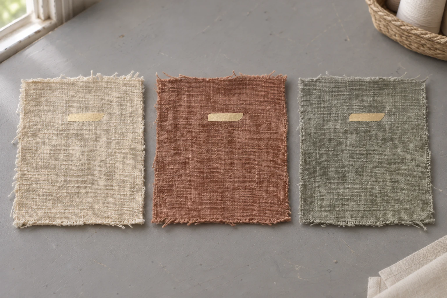
To assess the same foil across several fabric colours, put an identical mark on each fabric and review the samples together under the same light. First look for contrast between the foil and the unprinted cloth. Then tilt all the samples together to see when the metallic reflection becomes stronger or fades. Check the foil on a curved sample as well if it will sit on a fold, flap or shoulder. A collection can use one foil code throughout while allowing each colourway to have its own level of contrast. If the brief calls for comparable visibility, decide whether the actual design delivers that effect on each fabric.
Consider a warm ecru, a muted terracotta and a dusty sage. Each has a short mark in the same champagne gold foil. On ecru it may be quiet enough to read as a fine highlight. On terracotta the same mark may appear prominent at a glance. A request to make the foil consistent could mean using precisely the same material or giving the mark a similar visual presence across colourways. Ask which aspect matters before the samples are made. If the common material is the requirement, record the expected variation in appearance. If similar visibility is the requirement, compare the actual mark on all intended fabrics.
Record the supplier's foil code, finish and lot wherever those details are available. A name such as champagne can cover different shades or levels of gloss. For the first comparison, use the same physical roll or a single lot if possible. Keep the mark the same size and orient it in the same direction on each piece. Leave a clear area of bare cloth beside the foil. That area shows the base colour and texture under the same light as the printed mark. Set the swatches out with enough space to see the immediate surroundings of each mark, and keep the underlying surface neutral.
Decide which materials belong in the test. Three colours on the same fabric construction offer a practical starting point if the question is how the surrounding colour affects the way the foil reads. A fabric with a more pronounced weave or a different finish can also change the appearance of the applied area. Where the final range uses more than one construction, compare those actual fabrics together for product approval. If you need to explore the contribution of colour independently, prepare another set on matching constructions. Keep the two observations distinct in the approval notes so they can be applied to the right decision.
Print the actual motif size for each colour, especially if the effect is a narrow mark or small lettering. A wider patch made with the same foil can be useful beside it. The wide patch gives you room to follow the highlight as you tip the surface. The small mark tells you whether the design has a clear outline at the distance from which people will usually see it. Note which part of the sample is for overall sheen and which is the proposed motif. A bright large patch alone gives limited information about a fine line placed next to a seam or across a fold.
Mark the cloth direction on the back of each piece before laying out the set. Align the samples for the first review. If one colourway will be cut in a different direction in the finished product, check that orientation separately afterwards. The first view gives you a shared frame of reference. The second brings the sample closer to the intended use. Where light catches a rib or diagonal weave, turning a single piece can change the appearance of the background and the highlight at the same time. A simple direction mark makes it easier for another reviewer to reproduce the first comparison.
Place all three swatches flat and use a light that illuminates the entire set evenly. Start from one viewing position. Look at the line itself and then at the cloth directly around it. In the ecru sample, the foil and the surrounding yarns may have similar lightness in that view. In terracotta, the line may have a more distinct outline. A change in perceived warmth can also come from the surrounding colour. When describing an opaque foil, record what you observe in the specimen. A comment such as “the edge stands out more on terracotta” identifies a contrast difference without assigning it to a change in the foil's own colour.
If the foil looks uneven, inspect the location closely before choosing a different colour. Can you see yarn through a break in the mark? Does a fine light line follow the direction of the cloth? The entire surface can appear less bright on one colour simply because there are small places where the transfer is incomplete. Check where these areas occur and whether they repeat on a second swatch. If the difference survives when the piece is rotated and the light is changed, document the affected area and confirm application quality on that fabric before drawing a conclusion about its colour. Retain an untouched piece of the same cloth for the comparison.
A deliberately translucent metallic effect is a separate material choice. If the product specification allows colour to show through, assess the actual combination of that film and each base fabric. Compare several areas, including the motif edge and a wider patch. Keep the colourways for that material together. An opaque foil and a translucent film can be useful trials for the same design brief, but their observations belong with their own samples. If one line is less legible because fabric colour is visible through it, the recorded result should identify what film was applied and what the surrounding cloth looked like.
Once you have noted the first view, tip the complete set in one direction. Return it to its starting point and repeat in the other direction if relevant to the product. There will be angles where the mark gives a strong highlight and angles where there is less contrast. Tilting all the pieces together lets you judge how the colourways behave in the same viewing geometry. Place the swatches on one rigid card if hand position is hard to repeat. If a lamp or a window is much closer to one end, swap the left and right samples and review again before attributing a difference to a particular cloth.

Make a separate comparison for a mark that will follow a curve. The flat swatch helps you see the colour relationship clearly, while the shaped piece shows where the highlight might run across the mark as the object moves. On a bag flap, a short foil accent on the crown of the curve may catch more light than the same mark lower on the bend. Try the actual placement on a sample that can be held in the intended shape. Look at it from the normal viewing position, then move slightly to either side. If one part of a long accent disappears into shadow, note whether that is acceptable in the design.
Choose a second light condition with the buyer or designer if the intended setting makes the decision sensitive to reflections. A general studio light can show how the mark reads across the group. A more directional light can show how the same mark changes as the sample moves. Hold the location, viewing direction and swatch arrangement steady across colourways during each review. The important result is how the foil performs its role in each relevant setting. A continuous edge that must remain readable in a displayed product has a different requirement from a highlight intended to become visible mainly when the fabric moves.
When a photo has to travel ahead of the swatches, put every colourway in the same frame on the same plane. Phone cameras may adjust exposure or white balance between separate shots. Take a second image of the whole set at a different angle if the change in highlight is part of the decision. Label the views clearly in your review notes. The images can point out a detail or show how the sample set was arranged. When approval depends on small differences in colour or metallic presence, compare the physical pieces under the agreed conditions and use photos to document the points discussed.
Keep a swatch of every approved colour on a single card or in a clearly related set. Record the fabric and foil codes, the finish, the lot when available, the approximate date of the trial and the mark size. Leave an area of each fabric unprinted and keep a piece of the original foil with the record if further review is likely. Describe what the viewer should see. For the ecru example, the note could say the mark is quiet in the flat view and clear when the card is inclined. For terracotta, it could say the full mark is visible from the initial viewing position.

If the same foil has two jobs in the range, keep a sample for each job. On a small piece of branding it may need a consistent outline, while a large area of a trim can be judged by the movement of its highlights. Include the surrounding material on the approval sample when it affects the edge contrast. An ecru border next to a coloured panel changes what the eye sees around the mark, even when the fabric under the foil is the same. Observe the colours on a neutral background first, then repeat the review with the intended neighbouring materials present.
If a colourway falls short of the agreed visibility, determine what can change. Where the material code is locked, compare a wider mark or another placement on the same garment section. Where the mark itself is fixed, the designer may choose to trial a different finish or tone. Keep one earlier sample so the effect of each change can be assessed alongside it. Altering the artwork, fabric and foil in a single trial makes the result difficult to interpret. If a specification calls for instrument readings, agree what property is to be measured and how the surface will be positioned. One viewing or measuring angle may capture only part of a highly reflective finish.
Compare a new fabric delivery with the approved material before relying on an older appearance decision. Small changes in construction or finish can matter where the mark was close to the visibility required. When the foil lot changes, confirm the code and finish and recheck the more sensitive colourways first. That might be the ecru cloth with a fine line or a curved location on sage where the highlight was part of the approval. Put the new swatch beside the approved one and restore the previous direction and light as closely as possible. Keep the new record with its own date and lot details.
For the final review, bring the colour range, the actual artwork and any shaped or sewn sample that affects how the mark appears. Review the flat comparison before assessing the item as it will be worn or displayed. If the collection shares one material by design, make sure the approved appearances on the different cloths are clear. If the brief requires similar visibility, agree what that means on each real colourway. The guide to foil printing on fabric and sample preparation can help when preparing that trial. A retained physical card lets the next reviewer see the results, set out the same samples and repeat the comparison.
phone: +90 212 576 5250
fax: +90 212 493 0336
email: info@unlutransfer.com
Yenidoğan Mah. Eser Sok. No: 6-8
Bayrampaşa, 34030,
Istanbul / Turkey
TR 9150171175
Bayrampaşa Tax Office